Last week we continued working on the character design that we created the second week. Week five was all about line art, so after a very short introduction we were asked to do a cleanup of the drawing we created in the beginning of the course. I did find the introduction very brief and several of us were then left wondering how you create clean line art, feeling we were not shown any techniques on how to approach it.
That led to a lot of googling, trying to find good tutorials on how to do line art, which was surprisingly hard to find, mostly I found a wide spectrum of different tips. I then tried several of them and after two days of trial and error I found a way that worked for me, of course I still need a lot of practice but I am happy with the lines I was able to produce, given the short amount of guidance.
Here is the before...
and here is the final image...
As usual i will add the reflective assignment for you aswell.
I did at first experiment a bit with light but it did not feel like the right approach, instead I wanted to stay focused on the volume that I had tried to create when drawing the first one. Therefore I chose to use lines to show volume and depth by emphasizing important curves. I also used line thickness to show different materials in her clothing and accessories and they lead the attention to where the action is in the mouth area. I wanted her to convey strength and femininity and therefore I kept the lines thin and sharp but curvy and flowing avoiding straight lines. In the hair and clothing I have deliberately left some lines broken as it gives life to them instead of them looking stiff. I also emphasized the eyes and face as it is the most important part and her eyes reveal her personality as a hunter.
My biggest problem was getting the lines to being where and how I wanted them to be, also I felt it was not explained clearly to us how to do this task but that we were expected to find a way that works for us. After day or two of trial and error I finally found a way that worked for me, using a small, hard brush and drawing fast semi-long lines and pressing ctrl+z until it was where I wanted. Since all the construction was already made what remained was the tedious and deceptively difficult task of creating clean lines and the challenge of not loosing the feel of the original drawing and expression in the face.
lördag 21 december 2013
torsdag 19 december 2013
Gotland Game Jam
Last weekend I participated in the Gotland Game Jam, the theme was valuable and precious. Team "Trattarna" was made up by Oskar Frykmark, Anthon Fredriksson, Nils Wennergren and myself, two coders and two artists. We created a game called Melvind, it is a tower defense type of game where you will have to walk around and gather resources to build towers and fight enemies yourself. You play as the dwarf Melvind who is trying to protect his precious ale from the ketchup trolls, if you run out of ale you loose.
I am very happy with what we managed to come up with in the short amount of time although a lot of the art I produced did not get into the game due to the time limit.
There were several achievements for the game jam, we managed to incorporate several of them into the game, for instance one said the entire game had to be built using only pixel art and there was one called PEGI18 which meant the game had to include violence, nudity/sex, drugs and discrimination.
Here is a link so you can try it: http://www.doodlemeat.se/ggj13/
Here is an ingame screenshot aswell.
onsdag 18 december 2013
Turnaround
The fifth week was all about turnarounds, since all the groundwork had already been done during the construction it was not very difficult in general. I did have certain issues though but the assignment was rather time consuming than hard.
One of my biggest problems was the face, I found it really difficult to draw the same face multiple times from different angles, the draping in her clothes was the other main concern. Another problem was the proportions of the arms when straight out and of course having to draw her in such an unnatural pose (t-pose).
I am not completely happy with what I created this week, I would have spent more time on it and added details but under the circumstances I am very relieved that I managed to complete the basic drawings as much as I did since I got the stomach flu the day of the deadline. I am glad I managed to send something in at all and was very relieved when I saw that there was no reflective assignment for that week since I could barely think when trying to complete my homework.
tisdag 17 december 2013
Character Design
The third week of the 2D-course was spent on developing a character from one of the thumbnails we created during the first week, we were supposed to hand in the original thumbnail, a construction drawing and one complete drawing that is the last step before clean up. (The close up of the face was one of the VG criterias).
For a real game project I am not sure if the character i chose is the most interesting one to develop, but for this course and the assignments I felt it was the best one. The main reasons why I felt that way is partly that we were working a lot with volumes and this character would let me add things that help to show that and mainly because of the challenge of the pose and draping fabric which is very difficult. I did at times regret setting myself such a high goal but I am glad I did and that I managed to do it well.
Character Background
What´s his/her name? - Artemis
Male/Female? - Female
Physical health/handicaps? Athletic, swift, agile, strong, light (leather) armor
Personality? Calm, nurturing and innocent but temperamental and vengeful, young in the terms of a goddess and therefore a bit childish at times. A hunter – determined, patient
Family? Distant family of other gods
Intelligence? Smart, somewhat unaware of the world outside the forests
History? Ancient goddess, protecting pregnant mothers, children, forests and animals since thousands of years, goddess of virginity and the moon and very much effected by it
Hobbies? Hunting
Friends? Animals, a bit of a loner when it comes to humans but not anti-social
Add more here that is of value: Bow, lyre, deer, hunting dog
I know it is a lot of text but I will post my reflective assigment for the week as well.
I thought for a long time of which character to develop, finally I chose to continue working on my female archer, Artemis. The reason I chose her was because I felt it would be a challenge with the draping of the fabric and I could add accessories that would help show volume. I made several fast sketches to find a relaxed pose to develop but I decided to take this opportunity to challenge myself even more by choosing to position her aiming her bow at a 45° angle. I felt this character would give good practice working on volume, foreshortening and adding things on top of volume that flows with it. I have been trying to either feel or take the pose, imagining how she would feel and look and looking in the mirror to help with difficult parts as foreshortening and fingers.
I need to work on thinking in 3D and how to place clothing, so I thought this would be a good challenge for me. It turned out to be just that, however I think I managed to achieve what I wanted by implementing what I have learned these past few weeks. As I said last week I do not think I could have pulled this off in the beginning of this course.
Her style has been kept simple, with few details as I wanted to portray her as someone who spends all her days guarding the forests and hunting. Another reason for the pose was that it felt most fitting to show who she is, as her greatest interest is hunting. Her love for nature is shown in the choice of her accessories; it is also the reason why I have given her just a simple wooden bow and little jewelry with very simple design. The bracelets have been placed both to show her status as a goddess and to maintain the feeling of volume in a drawn character.
I wanted to keep her a bit young-looking as she is young compared to other gods and sometimes lets a childish side shine through. At the same time I wanted her to portray the wisdom and power of a thousands of years old goddess; therefore I chose to give her quite a strong nose and the expression in her face.
For a real game project I am not sure if the character i chose is the most interesting one to develop, but for this course and the assignments I felt it was the best one. The main reasons why I felt that way is partly that we were working a lot with volumes and this character would let me add things that help to show that and mainly because of the challenge of the pose and draping fabric which is very difficult. I did at times regret setting myself such a high goal but I am glad I did and that I managed to do it well.
Character Background
What´s his/her name? - Artemis
Male/Female? - Female
Physical health/handicaps? Athletic, swift, agile, strong, light (leather) armor
Personality? Calm, nurturing and innocent but temperamental and vengeful, young in the terms of a goddess and therefore a bit childish at times. A hunter – determined, patient
Family? Distant family of other gods
Intelligence? Smart, somewhat unaware of the world outside the forests
History? Ancient goddess, protecting pregnant mothers, children, forests and animals since thousands of years, goddess of virginity and the moon and very much effected by it
Hobbies? Hunting
Friends? Animals, a bit of a loner when it comes to humans but not anti-social
Add more here that is of value: Bow, lyre, deer, hunting dog
An early version of the construction, you can see how I have placed the clothing on top of the underlying construction. |
I thought for a long time of which character to develop, finally I chose to continue working on my female archer, Artemis. The reason I chose her was because I felt it would be a challenge with the draping of the fabric and I could add accessories that would help show volume. I made several fast sketches to find a relaxed pose to develop but I decided to take this opportunity to challenge myself even more by choosing to position her aiming her bow at a 45° angle. I felt this character would give good practice working on volume, foreshortening and adding things on top of volume that flows with it. I have been trying to either feel or take the pose, imagining how she would feel and look and looking in the mirror to help with difficult parts as foreshortening and fingers.
I need to work on thinking in 3D and how to place clothing, so I thought this would be a good challenge for me. It turned out to be just that, however I think I managed to achieve what I wanted by implementing what I have learned these past few weeks. As I said last week I do not think I could have pulled this off in the beginning of this course.
Her style has been kept simple, with few details as I wanted to portray her as someone who spends all her days guarding the forests and hunting. Another reason for the pose was that it felt most fitting to show who she is, as her greatest interest is hunting. Her love for nature is shown in the choice of her accessories; it is also the reason why I have given her just a simple wooden bow and little jewelry with very simple design. The bracelets have been placed both to show her status as a goddess and to maintain the feeling of volume in a drawn character.
I wanted to keep her a bit young-looking as she is young compared to other gods and sometimes lets a childish side shine through. At the same time I wanted her to portray the wisdom and power of a thousands of years old goddess; therefore I chose to give her quite a strong nose and the expression in her face.
The Pitch
I just realised that I had written this post about our big presentation but forgotten to post it so here it is.
This Monday was the day we had to be finished with our projects and pitch them to the rest of our class, the second year students, our teacher and staff. Of course we where nervous but we felt prepared as we had practiced a lot and put a lot of time into this project. We got some points on how to better present our games. Generally they were positive though and I had several people coming up to me afterwards telling me they really like our idea and that we did a great presentation that looked good and complete. We also managed to engage the entire audience in the discussion afterwards, which will help making them remember our game.
It felt really good afterwards, having gone up in front of so many people and actually pulling it off without being too nervous. I have also had people telling me they liked that we where two people on stage and managed it really well. Overall its been a stressful but fun experience and I hope I get the chance to do it many times again as I feel it is valuable for the future. Now there is only a report to be written and I will be finished with my first two courses at GAME, it has been at times very intense and I have learnt a lot, especially from the practical parts. I am looking forwards to seeing if "With Love..." will be produced and showed at the GGC next spring.
2D Week 2 Perspective
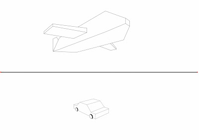
The second week of the 2D-course we studied perspective, once you know how to do it is rather straight forwards but it is tedious work and I did not find photoshop the best tool for this week's assignment which was to draw an airplane and a car in the same picture. Here is what I did along with the reflective assignment of the week.
After having drawn on paper during this week I have realised how messy it can be so I decided to do this assignment in Photoshop, although it was extremely time consuming I felt it would give a cleaner and more accurate result. I did not realize exactly how much time it would actually take compared to drawing it on paper but I believe it would just have turned into a mess of lines if I had tried to do it on paper. This unfortunately meant I did not have time to put in as much details as I wanted to and I feel the result shows perspective well and accurately but it is not an interesting picture.
I also found it a bit of a challenge when needing to build things vertically instead of horizontally, it felt strange as I looked at it and thought I have to do the exact same thing as I just did, just in the opposite direction. I did solve it but it was a bit difficult changing the way I think between vertical and horizontal.
Considering how much work it actually takes to create something very simple with correct perspective I wish it would show more. It does not look as if someone has put in a lot of time and effort when the picture is so simple, but I guess that compared to a fully rendered picture in which the artist has guessed on perspective the simple one would still look better.
The things I learned this week have been crucial to completing this assignment, I would not have been able to do it last Monday. Especially the use of crosses has been very useful, both for positioning and maintaining proportions. I would not have thought of thinking of for example an airplane as a volume before, I would have drawn outlines of how I think it should look. Now I have a new way to look at it, seeing also what is covered and I think it will be very helpful in my drawing.
måndag 16 december 2013
2D
For the past few weeks I have been very busy with the first 2D course. We have been working a lot on construction and building characters with boxes and cylinders. I have been working really hard, trying to challenge myself every week and that is probably why I have been doing so well.
Anyways I thought I should post what I have been doing for my home work these past few weeks so I will start with the first one. The assignment was to draw 20 thumbnails based on a concept - Clash of Heavens, a game where an ordinary person is thrown into a war between gods - they were supposed to be very quickly sketched and show a variety of different designs, (it did not have to be the main character). We were also supposed to show our three most dynamic sketches from our sketchbook, so here they are along with my thumbnails, I will also post the reflective assignment for this week at the end.
This week I have worked to focus on movement rather than drawing the model as I am used to. This was a challenge for me as I have always drawn to create a pretty picture and I realize that I must let go of that and do things completely different. That is one thing that caught me in Walt’s book, every drawing needs to have a purpose, I need to learn to try to tell a story when drawing instead of just wanting to create something that looks good. This is a knowledge that I have not been willing or able to accept until now and I am determined to get past it so that I can develop as an artist.
Although I have not been successful every time I have tried to convey personality and mood through posing instead of just having the person standing there doing nothing. I feel that what I have learnt this week, both in class and from reading, has really helped me create believable, expressive poses without having a model. This just by changing the way I think, or as Walt said, switching gears.
Another thing in Walt’s book that really struck me was what he said about lines, think about how and where to put them and not just do them because. Especially the part where he said “There are only four lines per cylinder and if it takes you twenty lines to make one – you need help!” It made me think that perhaps I need help, I feel my drawings at times get a bit messy and I found it a challenge trying to implement this, in particular remembering it while drawing. I really need to work on this and learning to know what line to put where and how it should look. It is very easy to copy a line, but not to create one that shows movement and life, I find that they easily become stiff and emotionless.
I have found it very difficult to keep all the new knowledge in mind when drawing, it is very easy to just fall back into the same old tracks and forget it all. I have to remind myself all the time as I realize from time to time that I am not thinking about what I am doing.
söndag 15 december 2013
With Love...
I know it's been a while since we finished our project but I thought I should post some screenshots from "With Love..." as well as the one page design. The first one is the start screen, the second is the action shot and the last one is the one page design document.
Prenumerera på:
Inlägg (Atom)