Visar inlägg med etikett 5SD032. Visa alla inlägg

torsdag 15 maj 2014

Fire

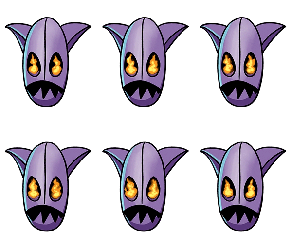
I have been spending some time now setting things on fire, at the moment for the main menu where there will be several animations, some of them fire.

Fire is quite a tricky and tedious thing to animate, but it is also in a sense quite forgiving since the movement of fire will look more realistic if it is not completely fluid. I have been spending almost the entire day today animating fire and I thought I would make a quick post showing some of it. These animations will be used to show when a player is ready to play.


onsdag 14 maj 2014

Tuesday

Today has been a productive day for me, the end of the project is coming closer and it feels like it is time to pick up the pace and work extra hard to make Totemic the best it can be.

I started out with making small feathers which will be used as particle effects when the gatherers die, at our weekly coaching session we were asked to make the totem pole "pop", since we have been told this before I started working on an animation for it. Although it turned out a bit "Las Vegas" it fits the style of the game and makes the totem more special.


When that was done I created some text we needed, copying the style of our logo and banner and started testing out a second death animation for the gatherers, this one for when they are caught in a volcano.


måndag 12 maj 2014

Gatherer deaths

Today I managed to create death animations for all four gatherers, to save us some time I created a general one that could be used for anything and used the same body for all of them. If we have time we will create more death animations to get some variety and an even more cartoonish effect but now we have at least one for all of them.

Here is how a couple of them they turned out


The animations were done in photoshop, basically I just moved the body in an arc and moved the legs and masks to follow the motion. For finishing touches I gave the masks facial expressions and moved the fur on the bodies a bit, I did not put too much thought into that since in the game they will be played faster and will look very small next to other things that small details will not be visible and is therefore unnecessary to spend to much time on.

fredag 9 maj 2014

Another week done

Since my last post, where I showed you the updated versions of the background and totem pole I have created this week, I have been busy working on animations and graphical material for the GGC which was due today.

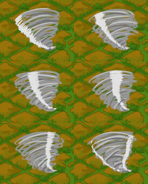
We needed animated visual representation of the "force field" power up so after some sketching, trying to figure out what it would look like, I decided to test something very different from what I had thought about to help myself think outside the box. I took inspiration from our first version of the defenders and Taz, the tasmanian devil, and created a tornado. The result did not feel right and did not really fit the profile of the power up, with some additional work it could potentially be used as a trap for another map in the game.


Instead I took inspiration from the pick up-sprite for the power up and made a semi-transparent bubble with a light going from the bottom to the top. I added one highlight and a half circle shadow to make it look rounder while trying to maintain the flatshaded, cartoony artstyle. The moving light I made by using timeline in Photoshop, moving and adding to it while moving it across the circle, bit by bit in the frames, in total I used ten frames. This fit the power up a lot better and after showing it to the team we decided to implement it in the game and it looks really well.


A lot of my time is spent going back and forth between the team members, helping and giving feedback to the artists and discussing things with the Lead Designer and the Lead Programmer, especially yesterday when the Lead Designer was ill and I got to take on a lot of his responsibility. The team worked really well and I made sure that everyone had a clear task to do so that the work would flow effortlessly, which it did. We were not able to start playtesting with four players this week as I had wanted to but hopefully we will be able to do it next week.

Today I compiled the artwork we wanted to hand in for the GGC, it included logos, concept art and screenshots. The screenshots are what took the longest time since the rest only needed our logos added to them, I tried to arrange them so that they would show as much as possible of the gameplay.
In this screenshot you see some particle effects I threw together today, as well as the shield and a volcano created by another artist.


The yellow and red defenders have just collided and are traveling away from each other, the purple gatherer has picked up a shield (or force field) power up and the yellow gatherer is holding the totem and earning score. The blue gatherer has picked up a crystal owl, which is a score multiplier that increases the score when holding the totem, as well as giving some score when picked up. The representation of this in the GUI is something I have also been working on this week and after a lot of testing and discussing with the rest of the team we settled with a crystal owl miniature appearing on the player's block on the totem, as well as a number showing how many you have, there will be a maximum of how many times it will multiply the score though.

I felt it would be a good idea to have a proper blog for the development of our game so I created one where we could post pictures and posts that follow the project in general, covering all aspects, while we write more in depth and personal in our own blogs. I think it will give a good overview and promote our game but also help the team to follow what everyone is working on. In addition to the blog, which van be found at totemicgame.wordpress.com I created a Facebook page where everyone in the team can post things to promote our game, it can be found on www.facebook.com/totemicgame.

So this is pretty much what I have been up to these past few days, during the weekend I will have to work with the Lead Designer to prepare and practice for our practice presentation monday morning before starting another week full of work.

onsdag 7 maj 2014

Upgrades

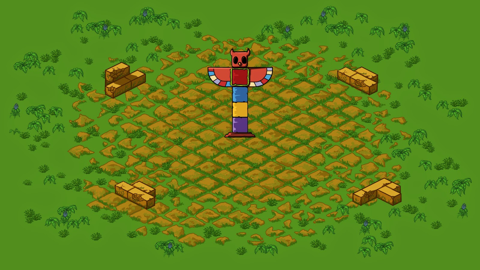
This week I have been working on developing the background image since it was very flat and boring and did not really blend with the other environmental elements. This was also true for the totem pole and we have gotten feedback stating that we should do something more with it. So I gave the totem pole some highlights and shadows that also gave the coloured blocks some texture. The background I gave some texture by adding old looking stone tiles and grass which highlights the area of the totem pole, the further away from the "scoring zone" the more broken and scattered they are until the jungle takes over towards the edges.
Here is how it looked before...


 and now...


I decided to recycle the plants we already had by changing the colour and bringing down the contrast to make them fit and blend into the background better. I used the grass mostly towards the center and the more jungle-looking plants towards the edges to make it look like a ruin centered in a jungle. During the playtesting session last week we got some comments that the screen felt a bit cluttered and i think that it was partly because the plants stood out so much against the background. By making them blend in more I have been able to use more of them, making the environment more interesting, without making it look as cluttered. I still have to wait until all new obstacles and the level design is complete so that we can test it properly in-game, but it is looking good so far.


lördag 3 maj 2014

Alpha Update

I thought I would just give you a quick update of how the Alpha presentation for our GGC project, went. So yesterday we first held a short presentation, covering the original concept, changes that had been made and what had been going well and not so well. After that we got to show the game to the audience before getting feedback from the three teachers present. As usual it was Oskar (Lead Designer) and I that presented, we got to go up first of all and it went really well, we got some advice and a pass for the Alpha assignment.

Later, during the afternoon, our class and the second years set up our laptops for a playtesting session were we got some additional feedback as well as confirmation that we are working towards our aesthetic goals. Most of the negative feedback we got was about the volcanoes which were not working as they should, the collision is off and it is possible to get killed when near it. The programmers had an idea of it being an area of effect but it is not intuitive and especially since there is no visual feedback the players do not understand, either way the collision should only be at the base of the volcano and only when the characters feet are near it. This was something that we were aware of and need to work on, apart from that the feedback was generally positive and the players seemed to enjoy it. Both during the playtesting session and the presentation we were commended for showing as complete of a game that we did, which felt really good.

Here is a screenshot from the Alpha we showed.


fredag 2 maj 2014

Alpha Week

This week has been busy as usual, we started out Monday morning with going up on stage to practice our GGC presentations. It went rather well, we definitely need to prepare more and keep working on our presentation but it seemed as we had gotten further with our presentation than some of the other teams. The point of this presentation was to show what we had ready at the moment and get some valuable feedback on what we might want to add, remove or change. We got some really good advice and immediately made changes, both inspired by the feedback and by other teams. We did feel that it was challenging to create the presentation considering how unfinished the project still is and I think it will be changed even more before the big one at the GGC.

For the presentation I created a PowerPoint presentation and a PowerPoint template that we will use for all presentations in the future, I also created a PowerPoint presentation for the Alpha presentation we had today.


This week I also created a foot for the totem pole, since it looked a bit like it was floating on the game space. I thought it would be a good idea to have it for the Alpha and following playtesting session to aid the audience and the players to understand our vision since there had been some people pointing it out before. This is how it looks at the moment, there are also some new art assets created by our other artist that has been placed to make the gameplay more interesting and to decorate the background.


Since the original placeholder art and animation for the gatherers did not look right I created a new one. It needs some polishing but it looks very comical which was exactly what I was aiming for. Previously they had really long legs which took up about half of their frames, I thought it would be better to make the bodies smaller in comparison to the masks and scale them up while cutting their legs at their knees. (The original placeholder can be seen in the mockup above). Here is how it turned out.


I have also been looking at the power-ups this week, I created two placeholders as we needed them when showing the Alpha, although they will need to be iterated since they did not turn out as I wanted. I had an idea that I wanted to test but they did not really fit the art style, they looked more like they would belong in the game we designed last semester called "With Love...". They did however look well enough for the Alpha and were implemented, we will have to figure that out when we start completing all placeholders next week. We want all art to be complete prior to the Beta so that the programmers have time to implement it and still have time to work out any issues and finish balancing the game and controls.


Late the night before the Alpha presentation the Lead Programmer asked me to make a quick win text that he could place on a white background. I quickly created four winner texts and a background (that was not white) to use for placeholders, so that we would have something, although in the end he unfortunately did not find the time to implement them. At the moment it is just text but we will change that later, perhaps have a a text saying "wins" or "winner is" and then have the mask or the character appear next to it.


torsdag 24 april 2014

Logos

Today I have been working on a logotype for our team called "Lingonskogen" (Swedish for "the lingonberry forest"). We wanted to include lingonberries in the logo so the first thing I did was to research some reference photos and then make some quick sketches in Photoshop.


After drawing these and discussing with the team I got a clear picture of what we wanted to create and transferred the sketches to my sworn enemy called Illustrator. Since I am very new to using Illustrator it took me some time to get the result I wanted, in the future this will probably be less of a problem as I get more and more familiar with the software. I think one of my biggest issues is that it looks a lot like Photoshop, but it does not behave like it and that some, practically identical, options are named differently. I also think it is a matter of practice to understand how the anchor points and lines work which has been a major source of irritation. As usual when working I had my laptop connected to a projector so that the team could see what I was doing and give instant feedback, especially our Lead Designer Oskar Lidh Frykmark helped me out with the design.

The end result however, once I managed to win against Illustrator, turned out really well, I created two separate sheets, one for light backgrounds and one for dark backgrounds. We want to have several versions of the logo so that we can choose depending on what we want to place it on, for instance a t-shirt or a poster.


onsdag 23 april 2014

Totemic Banner

We are getting well on our way on the Totemic projec, we are working hard but there is still very much to do. Last week I started working on our banner for our booth at the Gotland Game Conference that was due yesterday, even though easter got in the way I managed to schedule my time to finish it in time for the deadline without stressing too much.

Initially I had a lot of problems with the font for the logotype, I had never attempted to make my own font before but we felt we wanted to make something a bit more special than just choosing  a standard font. One of the major issues was that I had never used Adobe Illustrator before, which meant I had to learn a new program aswell, because of this it took much longer than it probably should have to create the font.

We had previously found a font that we felt fit our concept so I decided that I would use it as a base when creating the logo. I searched Google for illustrator tutorials that I experimented with, although some helped me learn the basics of the program I did not really find anything that was really useful to what I was doing.

There was an initial thought of making the logo look like wood or stone, the logo for Disney's Tarzan was one source of inspiration for this. Therefore I wanted to make it rather thick and experimented in illustrator making the font bolder.


It did not go as well as I wanted but I got something to work with that I moved into photoshop and sketched on top of it. When I finally had something I liked I moved it back into illustrator and finished the line art for it. The finished font was then placed onto the image in Photoshop and coloured, this is probably not the best way to do this but it worked.

Here is how it looked when it was moved into Photoshop and how it turned out.


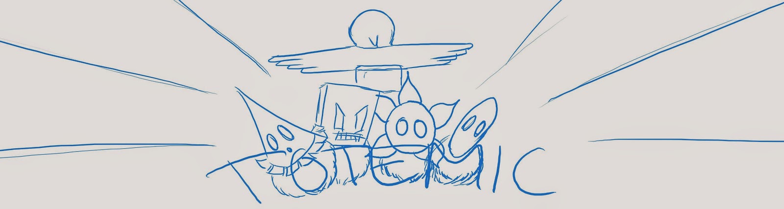
After some sketching I decided to use a triangular composition with the logo on the bottom, the characters in the middle and the totem pole in the center as that is what the game is all about. The background was an issue though, there were lots of ideas among the team, but we wanted there to be action somehow. This is the sketch that we decided we wanted to keep working on and how it looked when I added the elements.


At this point I was very unsure of what to do with the font and the background, luckily we had a graphics coaching session the day after, during wich I got some really helpful advice and ideas. Some of it I had already thought of but did not know how to do it and some where things I had not thought of. This is the first iteration after that session.


After that there was a lot of work redrawing all line art since it was originally drawn in a lot smaller scale for other purposes and to colour everything. This took some time as I wanted to use flatshading with clean sharp lines. Making the logo stand out was also a challenge that appeared when colouring but I think that it turned out well in the end.
Here is how it turned out in the end and what will be seen on our booth at the GGC.


måndag 7 april 2014

Totemic

Last week the class got to divide itself into new groups for a new course to start making games for the Gotland Game Conference (GGC). Half of my old team is the same with the addition of one artist, one designer/artist and one coder. The theme of the GGC is unconventional controls and after completing "Terminal" we wanted to focus on keeping it simple and polishing it to perfection.

We started a few weeks before starting the course with brainstorming what controls to use and finally decided that we wanted to have the player control two characters simultaneously, one with a joystick and one with a trackball. One of our aesthetic goals is "chaos", we want there to be a lot for the players to keep track of and we want them to engage in friendly competition, shouting and pushing each other while having fun. That was one reason that we decided to create the game for four players, having eight characters on the screen at the same time will help us reach that goal.

When the course started we were still brainstorming on where the game would be set and who the characters would be, the original idea was of little geniuses controlling their homemade robots but in the end we chose to go with a shamanistic/tribal theme set in a tropical environment. The characters would be one shaman and one spiritual creature that they had summoned to protect them from the other shamans' creatures and to stop the other shamans.The shamans were during the concept phase turned into forest spirits wearing tribal inspired masks and costumes and the summoned creatures were to be whirlwind-like, wearing the same mask and colour as their shaman.

The team soon decided for the game to be a "King of the hill" kind of game, placing a totem pole in the centre that each player would need to control for a total amount of 30 seconds to win. To make the game more interesting, as another of our aesthetic goals is "anyone's game", we decided to take inspiration from the negative feedback loop of "Mario cart" to make it more difficult for the player holding the totem and easier for the other players to take it over. We felt that this would make the players use both characters more and keep moving around instead of just going straight for the middle, this is going to need a lot of balancing though.

Along with the other artist, I started working on finding inspirational images, creating Moodboards and making Concept Art as well as starting to list all artefacts that would need to be created in a Scrum Backlog. Together with the Lead Designer, Oskar, I put together a PowerPoint presentation and went up in front of the class and a, larger than usual, jury of teachers and teacher's assistants to pitch our idea. We did not get any really negative feedback and most of the things that were brought up were things that we had already thought about. The biggest discussion was wether it would be too difficult for the player to control the two characters at once, in case it doesn't work we have several backup plans, for instance making it co-op instead. We got some valuable feedback and managed to get a green light for the production of our game called "Totemic".

I will finish what turned out to be an essay of the first week at the "Theme Park"-course with some Concept Art I created.