

Visar inlägg med etikett Line Art. Visa alla inlägg
Visar inlägg med etikett Line Art. Visa alla inlägg
lördag 19 september 2015
Sneak Peek
Here is a sneak peek of one of my new Tamarrion drawings, it is pretty much finished line art and about ready to have some colour applied to it!


onsdag 23 april 2014
Totemic Banner
We are getting well on our way on the Totemic projec, we are working hard but there is still very much to do. Last week I started working on our banner for our booth at the Gotland Game Conference that was due yesterday, even though easter got in the way I managed to schedule my time to finish it in time for the deadline without stressing too much.
Initially I had a lot of problems with the font for the logotype, I had never attempted to make my own font before but we felt we wanted to make something a bit more special than just choosing a standard font. One of the major issues was that I had never used Adobe Illustrator before, which meant I had to learn a new program aswell, because of this it took much longer than it probably should have to create the font.
We had previously found a font that we felt fit our concept so I decided that I would use it as a base when creating the logo. I searched Google for illustrator tutorials that I experimented with, although some helped me learn the basics of the program I did not really find anything that was really useful to what I was doing.
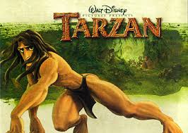
There was an initial thought of making the logo look like wood or stone, the logo for Disney's Tarzan was one source of inspiration for this. Therefore I wanted to make it rather thick and experimented in illustrator making the font bolder.
It did not go as well as I wanted but I got something to work with that I moved into photoshop and sketched on top of it. When I finally had something I liked I moved it back into illustrator and finished the line art for it. The finished font was then placed onto the image in Photoshop and coloured, this is probably not the best way to do this but it worked.
Here is how it looked when it was moved into Photoshop and how it turned out.


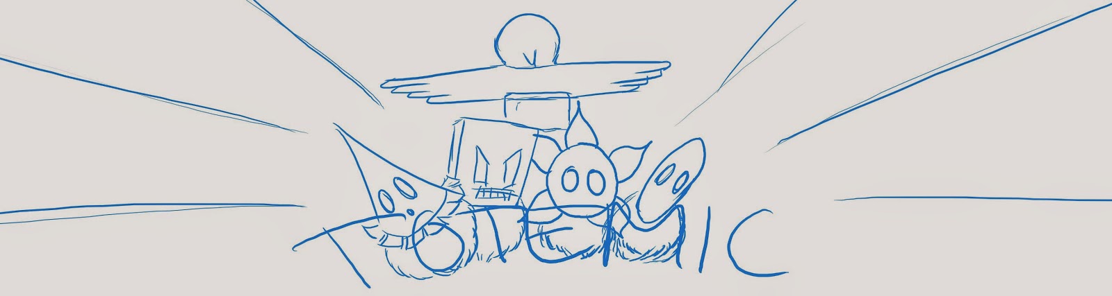
After some sketching I decided to use a triangular composition with the logo on the bottom, the characters in the middle and the totem pole in the center as that is what the game is all about. The background was an issue though, there were lots of ideas among the team, but we wanted there to be action somehow. This is the sketch that we decided we wanted to keep working on and how it looked when I added the elements.

At this point I was very unsure of what to do with the font and the background, luckily we had a graphics coaching session the day after, during wich I got some really helpful advice and ideas. Some of it I had already thought of but did not know how to do it and some where things I had not thought of. This is the first iteration after that session.

After that there was a lot of work redrawing all line art since it was originally drawn in a lot smaller scale for other purposes and to colour everything. This took some time as I wanted to use flatshading with clean sharp lines. Making the logo stand out was also a challenge that appeared when colouring but I think that it turned out well in the end.
Here is how it turned out in the end and what will be seen on our booth at the GGC.

Initially I had a lot of problems with the font for the logotype, I had never attempted to make my own font before but we felt we wanted to make something a bit more special than just choosing a standard font. One of the major issues was that I had never used Adobe Illustrator before, which meant I had to learn a new program aswell, because of this it took much longer than it probably should have to create the font.
We had previously found a font that we felt fit our concept so I decided that I would use it as a base when creating the logo. I searched Google for illustrator tutorials that I experimented with, although some helped me learn the basics of the program I did not really find anything that was really useful to what I was doing.
There was an initial thought of making the logo look like wood or stone, the logo for Disney's Tarzan was one source of inspiration for this. Therefore I wanted to make it rather thick and experimented in illustrator making the font bolder.
It did not go as well as I wanted but I got something to work with that I moved into photoshop and sketched on top of it. When I finally had something I liked I moved it back into illustrator and finished the line art for it. The finished font was then placed onto the image in Photoshop and coloured, this is probably not the best way to do this but it worked.
Here is how it looked when it was moved into Photoshop and how it turned out.
After some sketching I decided to use a triangular composition with the logo on the bottom, the characters in the middle and the totem pole in the center as that is what the game is all about. The background was an issue though, there were lots of ideas among the team, but we wanted there to be action somehow. This is the sketch that we decided we wanted to keep working on and how it looked when I added the elements.
At this point I was very unsure of what to do with the font and the background, luckily we had a graphics coaching session the day after, during wich I got some really helpful advice and ideas. Some of it I had already thought of but did not know how to do it and some where things I had not thought of. This is the first iteration after that session.
After that there was a lot of work redrawing all line art since it was originally drawn in a lot smaller scale for other purposes and to colour everything. This took some time as I wanted to use flatshading with clean sharp lines. Making the logo stand out was also a challenge that appeared when colouring but I think that it turned out well in the end.
Here is how it turned out in the end and what will be seen on our booth at the GGC.
torsdag 20 mars 2014
Intro
I have been very busy lately working on a comic book page styled intro for our game "Terminal" and I thought I should give you an update of what I have been doing.
As we had a storyboard assignment for the 2D course last week I thought I could kill two birds with one stone, since it was practically the same thing that I needed to do for this project. I reworked and added to a very basic storyboard that I doodled up very early in the project and when I was done with the 2D assignment I chose the most important frames to tell the story and arranged them like a comic book page.
This is the assignment I handed in, the Swedish text is a short description of the story being told, ...
and here is what I have done so far.

To keep it cohesive I have started with making all frames in grey scale, all the while focusing on work speed rather than detail, when I am finished I will start thinking about textures and colour. I will go more into detail of the how and why when I am done in one of my weekly blog posts and I will leave you with the one that is complete.

As we had a storyboard assignment for the 2D course last week I thought I could kill two birds with one stone, since it was practically the same thing that I needed to do for this project. I reworked and added to a very basic storyboard that I doodled up very early in the project and when I was done with the 2D assignment I chose the most important frames to tell the story and arranged them like a comic book page.
This is the assignment I handed in, the Swedish text is a short description of the story being told, ...
 |
and here is what I have done so far.
To keep it cohesive I have started with making all frames in grey scale, all the while focusing on work speed rather than detail, when I am finished I will start thinking about textures and colour. I will go more into detail of the how and why when I am done in one of my weekly blog posts and I will leave you with the one that is complete.
torsdag 13 mars 2014
Ms X 2.0
This week I
have completed my drawing of Ms X that I posted here a short while ago and I thought
I would show you a little more about how I worked.
I had an
idea of the pose I wanted, so the first thing I did was searching Google for
references of women looking over their shoulder. I found one that had an angle
I liked and to save me some time I moved her body and arms to get the pose I
wanted. I then used that for reference of proportions and positions in a rough
construction sketch and added her hips and legs. This first sketch went really
fast to draw so that I could see if it would work before putting too much time
into it.

When the
first sketch was done I started cleaning it up, taking it to solid line art,
first only her body and when I was happy with that I added the clothes and hair
on top.

I used a
small hard brush with shape dynamics and fast strokes to get as clean lines as
possible – keeping one hand on the ctrl+z buttons. Again, I looked at Ms Marvel
and decided to keep the line art thin, with the edges thicker. The lines in her
hair were particularly tricky, as hair normally is, and I had to rework it
several times, looking at my references, before I was happy. I also used
several reference photos of silk blouses and pencil skirts to create the
creases of her clothes and for the face I looked at our Concept Art.
To get cohesiveness
with the background upon which she is to be placed and to get the values and
slightly monochromatic colours of the Ms Marvel comic I rendered her first in
grey scale, using the same brushes and techniques that I used for the
background.

I started
with colouring her grey and then add light and shadow and used the smudge tool
to blend the colours before adding sharper details, especially in the clothes
and hair – always using a hard brush. The hair was, again, a challenge as well
as the face and I had to rework them several times.
To colour
her I used a colour layer in Photoshop, the colours were inspired by our mood
board for cohesiveness and I used only one colour for her blouse and hair,
while her skirt was left very dark grey. I did not want her face to look flat
though, so I added some pink, peach and reddish tones on her cheeks, chin,
forehead and around her nose.

When I
finally added her to the background I also placed her underneath a gradient
from the sun so that she would look affected by the sunset outside the window
and an inner shadow which I changed to colour dodge in a light colour from the
center of the sun to create a rim light.

I am happy
with what I have produced and I think I have made it look like the style I took
inspiration from. If there was anything I would do differently it is probably
the face; I think it could use some additional work to make it look more like
the style I was going for although I think it works well the way it is now. If I
was to redo it I would probably use sharper shadows and flatter areas of value,
not blending the colours so much so that it would look more cartoony than
realistic.
I has been really helpful working beside other people who can give instant feedback and notice things that are not apparent to me who was been staring at it for a while. When I was nearly done I showed it to one of our teacher's assistants to get some tips on how to best finish it and our Lead Designer, Oskar, has been a great source of feedback while working next to me.
Prenumerera på:
Inlägg (Atom)