Visar inlägg med etikett Colour. Visa alla inlägg

lördag 18 februari 2017

#Artwar Character Contest: Briannon | Part 1 - Design

As I mentioned before, I am making a character for Cubebrush's #Artwar competition. I was a bit late to start and have had many issues along the way, but also learned quite a lot. I wanted to try and implement some of the things that I learned while making my hand painted sword, from design through texturing. It is definitely not as easy without the help I had then though, but time to test my wings and see if I can fly on my own. :)

Anyway, after finally figuring out what kind of character/creature I wanted to do, I started with writing a background story.

Among the centaur clans, the druids are considered to be the highest ranked and serve as their priests and connection with nature. They both worship and draw their power from the moon and the flora. At the end of their training a druid to be go through a ritual where they meditate for three nights under the full moon at the foot of their mother tree.
If the tree accepts them, it will then ask them to offer a part of themselves, usually a finger or a hand, and in return provide a sprout of itself to replace it. Briannon gave her entire left arm to an ancient and holy oak tree, which made her one of the most powerful druids her clan had seen in centuries. As a druid, she now spends most of her time away from her clan, walking the forests and caring for the plants, trees and creatures and protecting them from harm.

From there I tried to figure out different directions where I could take inspiration from that would support the story. Once I had that down and a pretty clear image in my head, I gathered a lot of reference images and started sketching.

Main Moodboard


I wanted to draw inspiration from the Celtic druids and use the oak tree and moon as "the most holy" that the centaurs worship. I also wanted to incorporate living, healthy plants, specifically oak since it is Briannon's "mother tree". I am considering giving her a bow, since I feel her magic is more about healing and life that she might use it to hunt for food or in case she needs to protect herself or the forest, even though she is not a fighter. At the moment that is probably more a question about time, although I think it would be good to manage to make some props.

Early Pencil and Final Sketch


I know that my biggest mistake at this point, that I will need to keep in mind for the future, is that I did not really explore the thumbnailing and creating more variations. But with the deadline coming up I really needed to get going.

My general idea was to have larger and fewer details further out, leading to a focal point with more and smaller details around the face/neck area. I also wanted to keep most of the skin open to take inspiration from Celtic body paintings and give her tattoos that would symbolise and show her standing as a druid.

Moodboard for Jewelry and Wood Parts


When I had a sketch I tested a few different colour variations, mainly on the body. I wanted to, again, draw on the moon and oak tree, therefore using the silver and dark blue of the night sky, with details of the green of a thriving forest to break it up, and also to complement the red hair inspired by the Celts.

Colour Test Lineup


In the end I decided to go for darker in the bottom leading to lighter at the focal point I want to create, and to not steal attention but still looking interesting and having beautiful texture on the (horse) body, I decided to make her a dapple grey. Yet again inspired by the silver of the night sky, almost scattered with little stars.

Final Coloured Sketch

tisdag 13 december 2016

Dagger Concepts

Since I already finished my sword, I was advised not to spend more time on it just because, but rather spend the final weeks of the Brushforge class applying what I have learnt on a new weapon. Since repetition is key to learning, I started concepting a dagger.


I went through the journey of coming up with a story, developing it with the help from some feedback, sketching, self doubt, sketching some more, wondering how others manage to create such intricate an gorgeous details, finally coming up with some sketches that do not look like complete trash and finally testing some colur.


Although I thing that my weak spot is still probably mostly in design, I really feel that I have leveled up in regards of colour, which I considered one of my greatest weaknesses before. There is still room for improvements, but if I may say so myself, it is a massive improvement from the coloured sketches I started out with in my last post about the handpainted sword.


Hopefully I will get some more of that awesome feedback that I don't know how I am going to do without and take one of these to the next level and then actually modeling and texturing it!

onsdag 23 december 2015

Texturing

Recently I have been serving as the assistant of our environment artist, helping him out with finishing the environment assets for Lord Valac's new room. I have done a few sprites that he will use for spell effects, but mostly I have been working on painting textures.

When we felt that we were falling too far behind schedule, due to all the things we have had to redo or had problems with, we decided to write down every single asset that we need for the area that we are currently working on and organising them on a priority list. We realised that we needed to change up the way we work in order to push things out so the coders have something to work with. We also need to release builds as soon and often as possible due to the course that we are currently taking.


Modifying the work process the way we have, with letting go of our own tasks and instead working together on the same assets has really sped up the process and it feels as if we are starting to get back on track. For now it is working well, but soon we will probably need to revert to the regular way of working, in order to get assets out simultaneously. When we start working on the next area of the level we cannot work on separate assets one at a time, but rather need to work with all lowpolys simultaneously and then all high polys and so on in order to maintain consistency.


Since I had already painted Tamarrion's new textures and found a new way of working on them it was easy for me to help out with the environments. Hopefully this will even help create a more consistent level of the art in the game. It was still a challenge though, as I had to find a way of painting surfaces that are new to me, most of the textures consist of only stone which cannot be found on Tamarrion's textures obviously.


The trickiest part was figuring out how the light would hit each tiny surface from the high poly, since we want to paint in more light and shadows into the diffuse maps in comparison to the old ones. Painting the banners was more of a straight forwards process that was not too difficult with a little help from references.


The carpets were another story though, we needed them to be visible and interesting enough while still not taking over the room. They are probably, up to this date, the most well worked textures that we have in the game, apart from Tamarrion's. It was a process of trial and error, pushing the level of contrast and details further and further until we found something that looked good in the engine, but still not being overly visible so that they distract the player or create crazy bouncing lights on the characters. In the engine we have also added clipping masks to make the edges look broken and give them more of an old and worn look.


In comparison to the textures that we created during the Big Game Project, I would like to say that they are now of way higher quality. I feel that I have developed a great deal since then as a texture artist, as well as in other areas. Back then I am still sure that we did the best we could with what we had, in the time we had. That learning process combined with studying the way others work on their texture after have really helped me level up my skills and ability to create the visual style that we want to achieve in the game.

lördag 19 december 2015

Nihteana

I have previously posted a sneak peek of the new boss that I have been working on, I have already written a long blog post about her on our devblog which can be seen here, but I thought I would just show some pictures of her character concept here as well.


The initial thought was that the first boss was supposed to be a lower ranked male general in Lord Valac's army but we wanted the prototype to show a greater range of what we had planned for the game and wanted to create a spell caster rather than another sword fighter. We decided that it was supposed to be a necromancer and sometime while drawing character thumbnails we decided to make it a female instead.

I had to rewrite the character story completely, but I think that Nihteana, which means "bird of the night" will be a much more interesting character than what we ad originally planned.


I am still working on her model, nut had to take a break from it as we decided to reprioritize and work together on finishing Tamarrion's updates and Lord Valac's new room. Instead of working on her I have been helping the environment artist out by painting textures and visual effect sprites. I did however find the time to finish her concept art, so here it is!


söndag 18 oktober 2015

Lighting Assignment

I posted a painting of a boy and a wolf in a snowy mountain landscape a while ago, I just finished with the lighting of it and handed the assignment in. The snow in general was a really tough challenge, just trying to figure out how the light would react to it. The trees and forest parts were also a big challenge, in the foreground especially for how to make them look detailed when they are covered in snow which essentially is kind of flat. In the end I am most happy with the mountains, although they aswell posted a great challenge, wat I am least happy with would be the trees in the foreground.

Overall this was one tough assignment for me, especially since I rarely, if ever, paint landscapes and have very little experience in painting environments. Anyway, that's enough talking for today so here it is.


fredag 2 oktober 2015

Sneak Peek Update

A while ago I posted a sneak peek of the new Tamarrion painting that I have been working on. It is starting to come together now and part of it will be found on our websites as a header. I just need to finish it off and perhaps spend just as much time on a background, but with other assignments as well it will have to take its time.

Those of you who have been watching my stream have followed me almost up until this step, but here is what it is looking like right now, the biggest difference from last stream being that I have reworked the sword quite a lot.


You can read more about Tamarrion on our facebook page and our Devblog, we are also working on a landing page although at the moment it is only possible to sign up and there is very little information yet.

torsdag 1 oktober 2015

Flat Colour Assignment

This week's 2D assignment was to colour the line art we produced last week, only using colour blocks. It has been quite a challenge actually since we were forbidden to use lighting and only allowed to work with colour blocks as my entire scene is covered in snow. I might work some more on it before doing lighting next week, but this is how it turned out.


måndag 11 maj 2015

Polypainting

Since the issue of polypaint not being able to be exported resolved I continued painting on the high poly model. Apart from the skin, especially the face that is the most complex part on the model, I have done little more than basic details. I have added light to all edges to make them look worn, and darkened creases.


As we want to create a hand painted look I have basically just blocked out where it should be lighter and darker. I would have done the same in Photoshop before going into details, had I done it all by hand. I think that it does not affect the time very much in any direction. The painting itself does take a bit longer to actually paint because Z-brush does not have as easy and accurate controls as Photoshop has, on the other hand it does give me increased accuracy as i can immediately place the colour shifts exactly where I want them, or as close as Z-brush's controls let me. In Photoshop I would have to estimate, save, check Max to see how it looks, make adjustments, save, look... until it looks right.


My conclusion from this, experiment I guess you can call it since I am trying to find new and improved ways to work, is that it is a fast and easy way to block in details. It is far easier painting on the high poly where you can clearly see all creases and details than it is working on UV templates. Even though it does take slightly longer to actually paint, it is sped up by the fact that you can use a mirrored brush so that you can paint general details on, for instance, two leg guards at once and that you can see exactly where the paint should be placed and how it looks in 3D.

Since I have only used Z-brush a few weeks and tried polypainting in it only two days there are probably many tricks that I don't know about that would give better and more accurate results, for instance sharper details. From what i have experienced so far though, I do not see that it could be an alternative for Photoshop when it comes to cleaning and detail work.


 During the first bake the hair was not correctly baked and the high poly of the corset went missing so the Diffuse for the body had to be redone, as it got too late at night we have not been able to rebake at the time of writing this. The eyes, boots and hair decorations also look strange since they were not included on the high poly, they have been painted separately so the two maps will need to be merged. The limitations I discussed are very clear here, in particular the pants, as the paint is very blurry. It is very possible that it is only due to my unfamiliarity with how to use the brushes and program though.


There were also some problems with the armour Diffuse, probably caused in xNormal. The belt is my fault since I was tired and merged the belt buckle to the belt on the high poly, which means the belt buckle was projected onto the belt. This is easily fixed by just painting it over, that area will be covered by the buckle anyway. The orange gaps on some parts, for example the belt, are a bit of a mystery though. If xNormal had problems projecting, or seeing, the edges, they should be white, we have no idea where the orange came from. Apart from that the armour pieces came out beautifully and it is just a matter of getting the details down.


söndag 10 maj 2015

Logo


What I have probably spent the most time on this week though is probably the logo, I started with some super fast sketches, just to get some ideas to base it on. After conferring with the teachers and my team I decided upon one design to continue working on one of them. I had a font in mind that we have used so far, after not finding anything better I decided to take it into illustrator and made it thicker and adjusted the size of the first and last letters.

Original Logo


Quick sketches for basic layout


Since Illustrator is not a friend of mine I decided to take it into Photoshop and continue working on it there. Probably the main change I did was making the serifs pointier and at a better looking angle. I started thinking of how I should go about colouring it to get the style I wanted. One night, inspired by one of my team mates asking me if I would take it into z-brush and do it properly as a joke, I thought of trying to create the letters in max so that I would have a base to work from with straight edges and basic lighting.

Font exported from Illustrator and fixed in Photoshop


Early version of Layout in Photoshop


Creating the letters went really fast, I started with planes and extruded until I had the basic shapes, then I added loops in the centres so that I would get the effect I wanted (see picture below) and moved them slightly forwards. The final step of the modeling was extruding the edges back so that they got some more depth. I did the same for the frame, I only made a quarter of it and mirrored it twice.

The next step was trickier as I had to figure out how to place the smoothing groups to get the straight edges where I wanted them. The letters that were rounded, O and R, I had to add edge loops around all edges so that I could meshsmooth them as they were looking jagged even with smoothing groups. It was hard to figure out how to place the loops on the complex shapes on the R so that I would keep my hard edges but not get any unwanted ones. In the end it turned out quite good though not perfect.
Had I had more time I would probably have experimented with meshsmoothing all of them and taking them into z-brush as I think I could have added a lot of character to them that fits the art style. It might not be the best way to do it but it would be fun to try it out.

From the rendering process in Max


Instead I added a light pointing in the direction I wanted and rendered PNGs of the text, frame and symbol that my team mate created for the main menu book and is seen on Tamarrion's armour. I used them to create colour blocks of the shapes, by doing it this way I managed to get very straight edges which are important in case we would like to print the Logo on a larger surface.

I duplicated the layers and played around with layer modes and a base colour layer to get the general colours and lighting that I wanted. Then I started hand painting in coloured highlights and shadows, making the text and frame more interesting and most importantly, truly visible. When they were very clear I added smaller details in the form of little cuts to give it more character and look more hand-made. This is the part that might have gotten a really good result in z-brush.

Frame and Font at point of only needing details and polish


The next step was to fix the background and the symbol so they would be at the same level of polish. This gave me quite a challenge, in the end I added colour to the shadows and highlights of the symbol and used a textured brush on a lighting dodge layer to make the background more interesting. I did not work the symbol any more because I do not want it to steal attention from the name of the game, but also from the time limit.

Final Logo that was handed in


If I have time I might continue doing some work on it but I do not see if it will do any good as everything it should be on will already be in print at that time. Also I am not at all happy with the background, I do not think it looks the way I would like and it looks a bit unfinished which I do not like. The text and frame turned out really well though, and most importantly they are very visible even when zoomed out.

lördag 9 maj 2015

Textures and Screenshots

This week has been busier than any week so far, especially us artists have had an insane amount of work to get done and it is not going to slow down before the end of this project. Today we had deadlines for handing in promotional material containing at least a finished Logo, four screenshots and four concept art/dev images as well as playtesting with the other students.

Screenshot created by my fellow artists


Us artists did not get to the playtesting since we had to work towards our deadline and we had a visitor helping us out with shaders and Unity.

I have been working simultaneously on the texturing of the character and the Logo, but I have also spent time with the other artists going through lighting and the regular giving feedback as well as searching for fonts. I started out the week by doing final touches, UV-mapping the main character and the armour and exporting all parts of the low- and high-polys so that I could send then to my team mate so he could bake normal maps and ambient occlusion.

While UV-mapping the UV checker turned into rainbow war paint


When the UV-mapping was all done I got started on the diffuse maps, since I have had so much else to do I did not manage to complete them entirely yet. I have blocked in all base colours and started to add details. I quickly noticed how difficult some parts were to paint as I had to figure out how the UV-s translate to the model, the eyebrows is one example of this as she looked very surprised in the first iteration.

I did have the normal map to work from but it did not prove to be perfect, I am thinking that I should probably use the ambient occlusion map to help me out with that. I did come to the conclusion that the tricky parts would be so much easier to just paint on the model, so we went in to Z-brush and managed to figure out how to paint on the model. Late at night we felt it was time to stop and I exported the sub-tools so that my team mate could bake them. It turned out that you cannot do that as the colour did not get exported with the sub-tool.

From the colouring process in z-brush


This meant that the day of the deadline which we had planned to spend on the screen-shots alone, had to be spent trying to get the textures from z-brush and into the game for playtesting and screens. We found a solution which meant that we had to create UVs and textures within z-brush. After three hours of crashing the program and searching Google we found that z-brush cannot create UVs on a model with that much resolution. This was a major set-back as all work spent on painting it has to be done again, without painting on the model making it easier.

Very early iteration of Diffuse maps


I had to give up and hurry to merge the model with the UVs with the one that has been skinned, this meant only copying and pasting the skin layer, so that will need to have a look at. The model was then sent to a second team mate to plot to the placeholder animations before being sent to the coders to put it into the game with the unfinished textures.

The ambient occlusion and normal maps are complete and look beautiful but the diffuse maps still need work and I need to create emissive maps for her runes and eyes. This is what I will be spending my weekend on as I want to be free to work on animations and UI next week.

Both the UI and the menus need new, non programmer-art, graphics and we also need to create particles and fancy effects and feedback.


måndag 6 april 2015

Base Mesh

As I finished the turnaround for our main character last week and did a quick colouring during the weekend it was time to start working on the base mesh. It was originally supposed to be due today, but I rearranged the schedule slightly to accommodate for the increased time spent on the concept art. I did manage to get quite far though, and might get it done tomorrow if everything goes well. Today was quite laid back and the offices quite empty, since it is still Easter. Most of us made it down to the office anyway for another relaxed day of work, in spite of it being a holiday.

Coloured version of Tamarrion


Before starting on the mesh I helped a sick team member out by making some last adjustments to the turnaround of the antagonist. There was mainly an issue of the pose being to straight and stiff, also some parts were lacking a bit of thickness. As we need to get started on the mesh I decided to not clean it up to perfection. I got the basics down and any details will have to get addressed during the modeling, we do not have any more time to spend on it at this point.

I also did some producer tasks, which meant adding all of the environment assets to our scrum now that the concept art for the level is done. We have waited until that to add the items to the list so that we would know exactly what we need. I still need to add deadlines for them, which I might get done tonight.


I started out the modeling by creating planes on which I projected the four different angles from the turnaround (front, back, left, right). Then I created a box, starting on the clavicles on the shoulders, ending by the armpit. From there I used extrusion to create, first the body, and then from the body arm, leg and finally neck and head.

Very first basic mesh


When I had the very first basic shapes, I started adding some loops across the body to get the general shapes, adding more as I went and moving on onto moving vertices and lines. I spent most of the time on fine tuning on the lower part of the leg and foot as that was where the biggest problems were. At the end of the day the leg started to look better but I still need to do a lot of adjustments.

Base Mesh at end of day


The next step will be to adjust the body, arm, and finally, the booty, as it can be a tricky area I want to save it until the other shapes are starting to look complete. I am thinking of trying to create a highpoly in z-brush once I have the base mesh down, I have only ever opened the program once though, so I will have to see how that will turn out.


torsdag 19 februari 2015

Paladin Concept Art

I have been working on a new piece of concept art for our upcoming game for a while now. It is another take on my paladin that I created earlier. This piece has given me a lot of practice in things that I have never or very rarely done before, for instance a full horse rendering and environments. It is very clear how much I have learned since starting school, but it also shows where I need more practice.


onsdag 23 april 2014

Totemic Banner

We are getting well on our way on the Totemic projec, we are working hard but there is still very much to do. Last week I started working on our banner for our booth at the Gotland Game Conference that was due yesterday, even though easter got in the way I managed to schedule my time to finish it in time for the deadline without stressing too much.

Initially I had a lot of problems with the font for the logotype, I had never attempted to make my own font before but we felt we wanted to make something a bit more special than just choosing  a standard font. One of the major issues was that I had never used Adobe Illustrator before, which meant I had to learn a new program aswell, because of this it took much longer than it probably should have to create the font.

We had previously found a font that we felt fit our concept so I decided that I would use it as a base when creating the logo. I searched Google for illustrator tutorials that I experimented with, although some helped me learn the basics of the program I did not really find anything that was really useful to what I was doing.

There was an initial thought of making the logo look like wood or stone, the logo for Disney's Tarzan was one source of inspiration for this. Therefore I wanted to make it rather thick and experimented in illustrator making the font bolder.


It did not go as well as I wanted but I got something to work with that I moved into photoshop and sketched on top of it. When I finally had something I liked I moved it back into illustrator and finished the line art for it. The finished font was then placed onto the image in Photoshop and coloured, this is probably not the best way to do this but it worked.

Here is how it looked when it was moved into Photoshop and how it turned out.


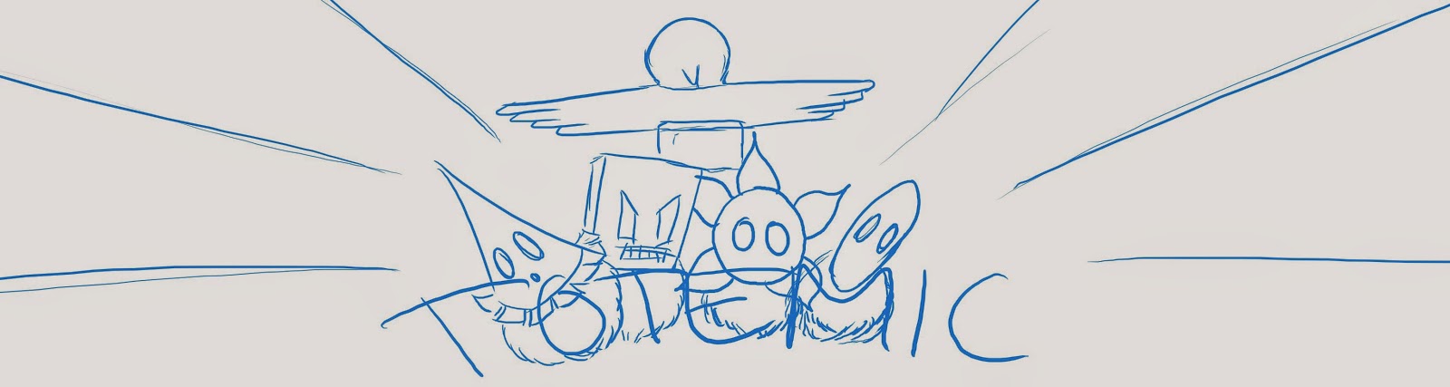
After some sketching I decided to use a triangular composition with the logo on the bottom, the characters in the middle and the totem pole in the center as that is what the game is all about. The background was an issue though, there were lots of ideas among the team, but we wanted there to be action somehow. This is the sketch that we decided we wanted to keep working on and how it looked when I added the elements.


At this point I was very unsure of what to do with the font and the background, luckily we had a graphics coaching session the day after, during wich I got some really helpful advice and ideas. Some of it I had already thought of but did not know how to do it and some where things I had not thought of. This is the first iteration after that session.


After that there was a lot of work redrawing all line art since it was originally drawn in a lot smaller scale for other purposes and to colour everything. This took some time as I wanted to use flatshading with clean sharp lines. Making the logo stand out was also a challenge that appeared when colouring but I think that it turned out well in the end.
Here is how it turned out in the end and what will be seen on our booth at the GGC.


lördag 12 april 2014

Practice

I looked through my old collection of pictures last week and was inspired by this half-finished painting and decided to complete it. It is a practice painting of a photo of Cara in Legend of the Seeker.