fredag 28 februari 2014

Gender Equality in the Game Industry

Gender equality is a very hot topic at the moment and the game development industry is no exception, one of the most discussed topics is the case of the female armor. Very often you see in games that male characters are depicted in full armor, looking strong and masculine while the female characters are given armor that barely covers anything; basically she is going into battle in a metal bikini.
Example of Female Armor from Baldur's Gate


There is a growing interest in something different and gender equality is something that is always present in our education and it was the reason for Sveriges Television's (SVT) visit to the university day before yesterday to make an interview on the topic. It was aired today and although I was sure they did not point the camera in my direction there I was in the background. Here is a link although it is in Swedish only: Här utbildas framtidens spelutvecklare.

 As mentioned it is a very hot topic and very much integrated in our education, we are asked to educate ourselves on the topic and every choice we make we have to be able to explain why we chose the way we did. The one thing I am thinking about now is when we got the question whether we only had male guards in our game during the alpha presentation. There are a lot of people who do not think that things need to be changed but I believe that there is a growing desire for something different; we have seen it before and there are a lot of people who want to offer the players something new. This will create a greater variety in the supply of games that is available. The most important thing is always to keep in mind that every choice you make sends a message to whoever comes in contact with your work and make sure that you can stand by your choices.

torsdag 27 februari 2014

Being shot

This week I have, among many other things, worked on an animation of the main character being shot. It turned out to be a rather tricky thing, I tried to imagine how the body would react if being hit by a bullet and tried to sketch it really fast. I experimented with movement in her arms, making them go up in front of her body but it did not look good at all and I soon realized that I should probably attempt a subtler approach.

This is a test that I threw together super fast to test how it could look if I tried showing the impact of the bullet in her arms, as you can see it did not look very well and after some additional attempts with the idea I decided to go in another direction.


The player experience needed to be more important than it being exactly accurate and since the game is already hard, and the fact that it is just outright annoying, it did not want to make the player have to wait and watch a long animation when being shot, instead of being able to flee. Therefore I thought of making something similar to the recoil of the animation I made of her shooting a rifle, it is clear and fast so the player gets the visual feedback of being shot and can quickly continue playing.

As usual I think it would have been good to have reference photos, instead I tried searching Google and YouTube for people getting shot, although I was a bit reluctant to check most of them out since I was a bit concerned about what I would get to see. I did find a video tutorial for special effects where I got to see someone acting that I thought I could draw inspiration from.

Then I started drawing up my recoil-idea, trying to feel the movement in my own body. I decided to push her body to the side and back and her head forwards and downwards. This was to simulate her taking a bullet in her right shoulder/side from the front. Once I got the idea down the animation was actually really simple. The challenge was to make it look like she was being hit while keeping it subtle enough not to irritate the player. This was also a reason that I chose to not move her arms much as I thought having her arms flapping about would only be annoying and over the top, especially when she is so small on the screen. Less is more was my key words when creating this animation.

Here is how it turned out when finished in colour.


If I was to do this again I would study more references and I think I should probably create additional animations, e.g. her being shot from the back but all in all I am happy with what I have created.

onsdag 26 februari 2014

Colour

Today we have studied light and colour theory, going through how light behaves and determines the colours. To study this we got to look at a lot of photographs of different environments, lighting and surfaces. This as well as getting to see an amazing artist create beautiful scenes and landscapes super fast was really interesting and I was inspired to try it for myself. After waiting all day we finally got to the practical part where we were asked to choose a triad (one colour and two colours adjacent to its complementary colour) of colours from colorschemedesigner.com and colour a very simple drawing of a face using the two similar colours as midtone and shadow and the third one for light. I chose to go with a dark purple for shadow, a cold blue for midtone and light yellow for light, I kept in mind what I learnt today about colour being more saturated in shadow and desaturated by light.

This is the image we got to work with.


We had about an hour for this assignment and this is how it turned out. A tip we got was to create a black and white filter so that you can see if the values look right since it is easy to get confused by colours and you can see the result of that underneath.


I am feeling really inspired to continue working with colours and I will try to put all that I have learnt so far into the background image for Terminal that I am working on at the moment.

tisdag 25 februari 2014

Speed Painting

Today we had a lecture with Felicia about values and a little bit about Photoshop. We looked a little bit at different brushes and brush settings and experimented with using brushes in color dodge and linear dodge mode. We also looked at some short films showing the difference in hue, saturation and value and how you can create environments really fast in gray scale using foreground, middle ground and background.
After lunch we got to do some exercises using what we learnt earlier. We were shown photos of mountain landscapes in gray scale and given fifteen minutes to draw it. The purpose of this exercise was to start thinking about value when drawing, it also makes you think about contrast and how to use atmospheric perspective.

This was the first one, I think it looks a bit flat as time went by really fast.


Here I realized I needed to work faster and I managed to get some atmospheric perspective into it. You can see that the further back something is, it has less contrast and is lighter while the foreground is the darkest part. Also you can see that the mountains are darker at the top and lighter at the bottom, creating contrast to the next level of mountains' dark tops.


This one did not turn out very well, it was a picture of treetops with thick mist between them and time just ran out way too fast. I should probably have used the tree brushes instead as I would have been able to do more a lot faster, I should also have used a different brush for the mist. My attempts at atmospheric perspective got lost somewhere in the mist.


This is the final one, a picture of snowy mountain tops. I think it looks ok but it could definitely use some more work to it and I am not too happy with the contrast between the grounds in it, it should be clearer what is in the foreground. In general I think it reads well though, especially when you zoom out a bit you can clearly see the snow coming down the mountain side.


I think it was a good exercise and it is definitely something I should practice more. I had thought of doing this with the background image I am working on for our game and now I am sure I will. I think drawing it in gray scale first will improve the quality of the values in the image greatly since it is not something I am very used to working with or thinking of.

fredag 21 februari 2014

Alpha

Today was our first milestone of our project - the Alpha presentation. All groups got to go up on stage in front of the class, some second year students and some teachers to present our game. It started with a short presentation of our group, why we chose the concept we did, what went well/could have gone better and our goals for the beta. This was followed by a demonstration of what our game currently looks like and how it works and finally we got to answer some questions.

The presentation went well and we were not surprised by the questions we got since most of them were things we have discussed earlier. One question for instance, was if we only have male guards and upon the answer "yes" we were asked why. We had early in the process discussed this issue and we thought about having guards of both sexes for the diversity, however we decided that we would rather focus on having fewer animations and doing them well and if we found the time later add female guards. That is a big if though and I do not think we will find the time; it will be better spent perfecting artifacts that are more important.

Another question we were asked was if we had any form of non-lethal violence in the game, they felt it was very unlikely that guards would shoot to kill in Sweden. Our main goal is to encourage the player to use stealth and discourage the use of violence, although it will always be an option. By making all violence extremely bloody and messy and humanizing the enemies we want to hint at the player "why are you doing this?". To answer the location issue, we wanted to put it close which helps the player to relate to the use of violence since you are always more affected by things that are close to you in some way, the need for it being super-realistic is not that great. Another reason is that there are not that many games that are set in Sweden and therefore it sets our game apart from others.

At this stage I am happy with what we presented and how it went, now we just have to keep working really hard and I think we can come up with something really good. I feel we are getting back on track now as we have located some issues - the main concern for me being the art style getting a bit lost on the way and not coming together with the music - and we are now on our way to fixing them.

Finally I thought I would show you some really fast sketches I drew this week, just to picture how the main menu could look like. This was mainly just to get some ideas for the layout, what kind of background? Do we want comic book dialogue boxes for menu buttons or perhaps comic strips?


We thought of using a scene from the interrogation room at the start of the level, with a flickering lamp and a mobile phone on the table but when sketching it I thought it looked too much like a 30-40's something mafia story. I felt that the ones showing the huge panoramic windows was a better representation of the game and I will be able to show airplanes landing outside, enhancing the feeling of an airport. I also felt it would be best to have the main character involved, looking like she is fleeing from something and try to incorporate comic strips for buttons. I feel that all these choices combined add up to what the game is all about.

This is a screenshot of what our first level looks like at the moment in our Level Editor. All graphics will be updated with a better colour scheme and textures and lighting to make the environment feel more alive and real.


torsdag 20 februari 2014

Weekly Blog Post


For this week’s blog assignment I thought I would tell you about the idle animation I created.

We decided that we wanted to have an idle animation before the Alpha-presentation tomorrow as it would look better than having her moving all the time.  Before starting I thought it would probably be really easy compared to the animations I have previously created but I had a really hard time getting started. I found that it is easier to move arms and legs to make it look like someone is moving, than making the body look like it is moving while standing still.

I started with some fast doodling and trying to think of how the character would move. One thing I thought of was putting her hand on her hip but I felt that is probably something you would rather do when in a more comfortable situation and I did not want her to look like she is comfortable and relaxed as it conflicts with our aesthetic goals. Instead I tried to imagine her nervous, maybe leaning forwards and looking around; it felt like it could become irritating for the player though. I figured that from a player’s perspective it would probably be most appreciated if she did not move too much, especially since she is supposed to be able to stand idle when hiding behind things, if I were the player I would not be happy if an idle animation was the reason that the guards found me.

That led me to experiment with her standing still, swinging slightly from side to side – unfortunately, that looked more like jiggle physics than anything else, which is not really what we are looking for. 

Finally I decided that I would at least start with letting her just stand there and breathe. The biggest challenge with this was to make it look natural and avoid sexualizing the character; we are looking for something other than cleavage and jiggle physics for “Terminal”. With this in mind I carefully moved her shoulders back and her chest slightly forwards, simulating taking a breath. I wanted the animation to be fluid and therefore wanted several frames; this was an additional challenge since I wanted to be very careful with the amount of movement.

The finished animation consists of four frames, it does look fluid but it also looks as if she is breathing rather heavily. That actually works with our idea of incorporating stamina; the player will be able to hear her breath getting louder as her fatigue increases.

What I would do different is probably, again, reference photos – lots and lots of them, studying someone who is not doing anything from above and filming would probably also be a good idea. The perspective offers a lot of challenges as it is not how you usually look at the world and can therefore be hard to visualize.

onsdag 19 februari 2014

Tuesday Update

It has been a while since my last post now, much due to the workload of our current courses. As expected I did not finish the animations I had planned on completing last week. I did manage to finish the sneak animation although it is still colourless, an effect that was very much appreciated in the game. We had not originally planned on having her colours look different when sneaking but considering the strong visual feedback it provides we are thinking about ways of adjusting and keeping the effect and enforcing our comic book theme. We are considering options like having her in her normal colours and making her semi-transparent, giving it the dot-effect sometimes seen in comics or perhaps just leaving it in outlines. This, along with many other things, will have to wait until after the Alpha though, which is this Friday.

During the weekend I tried to do some catching up on my other tasks, I finished a shooting animation, using a handgun, except for the colouring and got started on the one for shooting a rifle. I did not get very far on the rifle one as I did not have a weapon sprite to work with and i found it difficult to get the proportions right with my provisional weapon since I do not have that much experience of weapons.

As usual I referenced the photos we have previously taken to get a base for proportions and pose and then started constructing the body to finally add clothes on top of it. The aiming of the weapons was pretty straight forwards, as I said tricky with the rifle, getting the length of the weapon and her left arm right, it would probably have been easier with better reference photos. The next challenge was to animate the recoil, I searched Google and Youtube for videos of women shooting similar-looking weapons to see their impact on the body. Mainly I focused on trying to find videos of women who are not experienced with weapons and I ended up finding some useful ones which I looked at again and again.

When shooting the handgun I noticed that the upper body and head went slightly back and that the gun and lower arms went upwards, for some unfortunate women it ended up in their faces, that felt a little extreme though. Instead I moved her head and body a little bit and changed the perspective on the arms and gun, after a lot of additional tweaking it came together pretty nice. Animating the recoil of the rifle was a bigger challenge, much due to previously mentioned reasons. I wanted it to look different from shooting the handgun, pushing her shoulder back rather than moving up. The first version was a bit too cautious with the recoil so I pushed her shoulder back a little further and moved her head back and a little bit up as I noticed this behaviour when looking at the Youtube-videos.

I managed to finish the rifle one today and did the colouring of both of them, which took me a very long time since our coders want the clothes and body separately - meaning many many layers. According to our Lead Programmer the best way to do the character sprite sheet, since we are going to incorporate both disguises and different types of weapons, is to draw all frames of her body without clothes. That means the clothes have to be drawn and saved separately to be used as a layer, same goes with the weapons as they are their own object in the game and not part of her animation. Since her head and hair is supposed to partly cover both weapons and clothing, that as well will have to be in separate frames on the sprite sheet. This will perhaps come in handy though as we have mentioned the possibility of separating her head from her body to make her look in the direction of the mouse, making her look more alive. It is a lot more tedious work for us artists but I will have to trust our very talented Lead Programmer when he says it is the best way to make the game flow well.
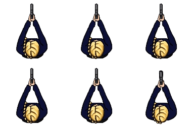


Well that was a minor essay and I still have so much more to discuss, I guess it will just have to wait for another day and hope I get the time to blog more often. I thought I would end this with showing you how the shooting animations turned out.


*I see now that there is one layer missing in one frame, I will have to fix that later.

onsdag 12 februari 2014

Sneak

*Note: For the weekly blog assignment read the run post*

As usual this week has been very busy so far, and the worst is not yet over. Since we have a deadline Friday I decided to take on doing a sneak animations, two aiming animations and two shooting animations, I was hesitant as it is a lot of work to do in the little time we have, however it has to be done. It would have been hard work getting it done and as expected a lot of other things have come along. Yesterday we started with a lecture in character design and then we gathered in our group to design our first level. We also had some things that needed to be worked on in our scrum document, so I was asked to sort out the items-list and the deadline dates.

I started with counting how many deadlines we had for each day, separating art/code/etc so I would get an overview of our current schedule. Then I started to redistribute deadlines more evenly and prioritize where necessary. When finished I looked over it again and repeated the process until I was satisfied, I made sure no deadlines were due on a day of testing and tried to avoid them the day before such dates where possible. I also made sure we had very few deadlines the week before and only one during the final week since I want our team to be finished with production since we will be very busy with testing and fixing things. that will also give us a little space for those things that will need to be added later. This took me a few hours yesterday and a couple more this midmorning, I also managed to get started on one of the aiming animations yesterday although it is only a rough sketch at the moment, trying to map out the proportions.

After lunch today I started on the sneaking animation, first i thought I would try to finish the aiming and shooting first, since they are easier and less time consuming, meaning that I could spend the rest of the week on the sneak-animation. Since we are considering using the sneak animation for walking and aiming we decided it would probably be better to get it done first.

Soon I realized that I was right in thinking it would be difficult, as usual I tried to ask Google for "woman sneaking" and as usual it was not very helpful since I was not looking for pictures of women eating, that is however a different discussion. Sneaking is not something I normally do so it was difficult to imagine and feeling the movement pattern and we all tried to figure it out and then went on with taking more reference photos.

After many hours of work I managed to get something that at least looks like sneaking, although I had big problems getting the arm movement right and working with the leg movement. I had to redo the arms many times before being satisfied, no I have to get some movement into the body and head aswell and then I can go on to refining and cleaning up.

I have only been working on the arms and legs so it is a bit stiff looking at the moment.


måndag 10 februari 2014

Running

Last week, as I have mentioned earlier, I decided to take on creating two animations for our game, currently named Terminal. The main character is of course the most important part and therefore we want the animations for her done as soon as possible. Since I have already discussed the walkcycle I thought I would write something about the run-animation.

I started by using some of the walkcycle frames as a reference for proportions, movement style and placement and redrew on top of that and decided that I would start with three frames and then add if I needed to. I also referenced back to the photos we took for the walk but that obviously had its limitations since you move differently when you run. I got a base for the animation rather quickly and reworked it a few times and got something that looked okay but something was not right. It looked a bit stiff so I tried searching Youtube for a woman running, unfortunately all I could learn from those result was how to do jiggle physics.

After some intense searching I did find some fitness instruction videos that helped somewhat, although I would rather have found someone who was a less experienced runner. The next step was running back and forth through the apartment to get a feel of how you move when you run and running towards the mirror, mainly to study the shoulders and arms. I eventually came to the conclusion that women generally keep that part rather still, mostly just moving the arms.

After that I reworked the frames again and then some more and finally added colour, I think it looks good but it is still not perfect, there is something with the legs going backwards that is a bit off I believe. That was really tricky to figure out how it looks, especially in the straight top down angle, and I will wait to see how it looks and works when it is tested in the game and then see if it needs to be worked on again.

The character is supposed to be a feminine woman who has not had any special training, she is not a competitive or experienced runner and probably has little time to go to the gym. Therefore I wanted her running style not to look too much like the fitness videos I found. I also decided to let her braid fly around behind her as this was something we had discussed and it added a sense of speed to the animation.

Something I would do differently is to take reference photos of someone running but I think it could be difficult due to the movement speed, especially without a good camera. If we had managed to get some decent picture I think it would have been helpful and I think I am going to suggest it when we are doing the animations for the guards.

fredag 7 februari 2014

Animation

This week I started with the animations for our game, currently named Project Terminal, the actual drawing of the walkcycle took me about 11 hours, I had estimated it to take about 10 hours so I got pretty close. I did spend some additional time on work related to it, like taking reference photos to see how a walkcycle looks from above. The reference pictures were really helpful and I used them at first as a guide as to where to put and move things and then I reworked and tweaked multiple times until I felt I was satisfied so that I could colour it. Now I will just have to wait until the programmers can implement it so that I can see if it needs to be fixed or if it works in-game. When I had finished the walkcycle I went on to the run, I have already created a base and reworked it several times but it is far from perfect at the moment. I think the runcycle will go faster since I have learnt a lot while doing the walk and that I can reuse the walkcycle as a guide, also I think I will not have to do as many frames for the runcycle.
Animating things is really fun but it is time consuming and difficult to get right, I would really like to learn how to do it properly. It is amazing to see something you have created come to life.


We have had a lot of meetings this week as I have mentioned earlier, yesterday we had another one with Adam Mayes which went really well. We got to describe our game and told him what we were going to do and why, he asked us just a few questions and then said we could leave since he had no remarks. Yesterday afternoon we had another meeting, this time with one of our teacher's assistants, we got to discuss how we were working as a group and how we feel about the courses we are taking right now. At the moment I feel the group work is running smoothly, there are no frictions and people are getting along and working together so I think we can be a successful team. Our main concerns during that meeting were instead the lack of information and confusion of the current two courses and the fact that we have so many meetings and lectures that we are constantly interrupted and do not get the time we need to sit down and work. Apparently several other teams had brought this up so there will hopefully be some changes from now on.

onsdag 5 februari 2014

Planning

Last week we were very busy with planning, designing and making decisions. The assignment for that week was to create a complete scrum backlog as we are required to work with scrum for this course. After meeting with our teacher, our scrum master and getting some feedback from our teacher's assistants we started to get a complete idea of what we want to create and at the end of the week I felt that we had come so far in the planning process that we could just get to work. As I write this I realize what a great resource of people we have to help us, we forget all too easily to use them.

This week we started with trying to create a sprint plan for this week in scrum, we did find scrum a bit complicated but I think once we learn it will be easier. I was hesitant but I decided I would take on doing two animations this week, estimating the work hours to ten hours each. I am very new to animating things and we have not had any education about it at all, which I wish we would have had by now, I am going to have to work really hard to complete these tasks but it has to be done.

Here is what the main character will look like in the game and beneath it is concept art for the two types of guards we will have.