lördag 25 februari 2017

Three Years Gone By - Speed Painting

I got a notification saying it is three years ago today that I posted my speed painting exercise from class in which we had to paint grayscale mountains in 15 minutes. When looking at the images I painted I felt that I can definitely do better now, and was curious to test my improvements over the past three years. So I picked three (a bit more complicated and detailed I realised) images and set the timer at 15 minutes.

Old Pics:


I was right last time about time just flying by and still need to get better at using different brushes for speed painting. In my defense, speed painting is something that I hardly ever do. :P
Although they are far from masterpieces I still do think that there is a slight improvement (fortunately).


fredag 24 februari 2017

#Artwar Character Contest: Briannon | Part 2 - Sculpting

All right, so last time I wrote about the design process of my character for the #Artwar contest, Briannon, I wanted to follow up with a post on the modeling and sculpting. Well, when I finally had by idea on paper and was ready to get started, I had this brilliant idea that this was a great time to try and learn new things. (Now with a week left of the contest and so much work to do, I am starting to question the brilliance in my idea).

First thing I did was to try out Maya LT, which I have actually never even opened before. Thanks to my knowledge of 3D in general, I managed to get "something" at least. It did however take forever and I absolutely hated the popup-menu system for everything that has a button in 3DS Max. I can say that if I had allowed myself to use Max instead, I would have gotten a great deal further than where I am at this point. In some miraculous way, I did eventually manage to create a good enough basemesh that I could import in ZBrush and go from there.
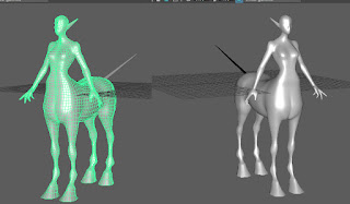
Basemesh in Maya


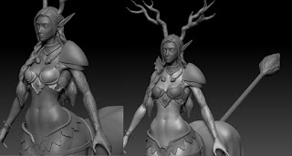
Even though it did take me a bit longer than it probably should, the body was pretty straight forwards to do. The challenge here lay in getting the anatomy right, especially on the horse part of the body.
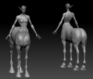
First pass on body in ZBrush


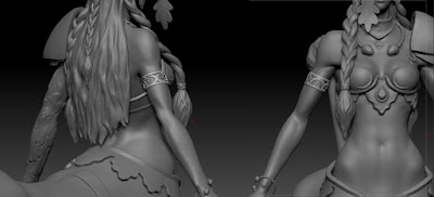
My next challenge was the hair, but with a lot of research and experimenting I managed to create and combine braids into an intricate hair style. For the future I will want to work on how to better sculpt the ends of the hair and making separate strands to get better volumes. One thing that was very helpful that I found mid-sculpting was the feature of making the window transparent so that you can place references underneath.
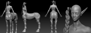
Experimenting with hair and braids


Hard surface accessories and armour is something that I would normally model in 3DS Max and then only import into ZBrush to create surface details, but since I have banned myself from using Max for this character I needed to find another way. After my experience with Maya when making the basemesh, I was really reluctant to go back to it. On the other hand, ZBrush is to my experience not optimal for hard surface modeling. Not having attempted to do something like this in either software, I had to do quite a lot of research (including mostly crappy and often barely understandable video tutorials) and experimented a bit with both.
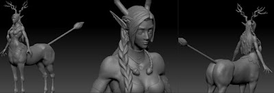
Hair Sculpt


In the end I actually did all of the sculpts in ZBrush entirely, not using what little I made in Maya. I did this by using masks, either painted directly on the model or by projecting alphas, and extruding from the existing sub tools. Strangely, something as simple as the twisted cord used for the torc and lower bracelet, was extremely challenging to find a good way to do, with a result that I wanted. I tried following other people's rope tutorials but did not like the outcome, or the quality of the tutorials were too poor. Instead of the multiple cylinders that they use, I projected a twisted alpha on a ring and used the deformation tools. The acorn, waterskin and the bag however, were  made from spheres manipulated by the move tool or zspheres.
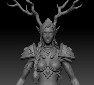
Shoulder design tests with alphas
Bracelet made with alpha


For the oak leaves and moons, I projected alphas on planes and created morph difference meshes and the just cleaned them up with deformation tools and bent the leaves and added some detail. For the 'triangular moons' and armour/jewelry details I also used alphas, by testing a technique shared by Orb in Blizzard's 2015 ZBrush Summit talk.
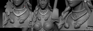
Necklace WIPs

First version of wood and resculpt WIP

The final challenge was creating the wooden parts. Since I want her to be part oak tree it needed to look like bark. The problem with oak trees is that their bark is very thick and rough and, although they are beautiful trees, not very attractive looking. I just could not get it to translate well on the more delicate character, possibly contributed by the fact that I have never sculpted wood before. Therefore I decided to represent the oak part a bit differently, I actually referenced an oak tree where the branch had wilted and the bark partly come off as well as looking at how others had solved the issue of sculpting wood. It was a bit tricky to sculpt, and it could probably be even better with practice and time, but I got the grade of 'I can tell that it is wood' and I am satisfied with the result.

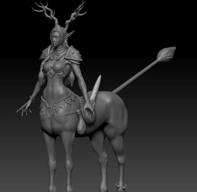
I have probably forgotten to mention a great deal of things and could definitely delve deeper into how I made each element for future reference when facing similar problems. :) But this is in general how the high poly sculpt was done, I definitely learned a lot and hope I can remember it all. The result is looking even better than I had hoped, so even though I am a bit stressed about finishing in time I am really excited about this character! :)
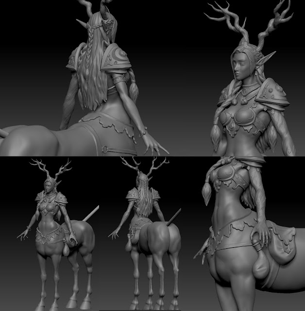
Final Sculpt
Bonus Pic

lördag 18 februari 2017

#Artwar Character Contest: Briannon | Part 1 - Design

As I mentioned before, I am making a character for Cubebrush's #Artwar competition. I was a bit late to start and have had many issues along the way, but also learned quite a lot. I wanted to try and implement some of the things that I learned while making my hand painted sword, from design through texturing. It is definitely not as easy without the help I had then though, but time to test my wings and see if I can fly on my own. :)

Anyway, after finally figuring out what kind of character/creature I wanted to do, I started with writing a background story.

Among the centaur clans, the druids are considered to be the highest ranked and serve as their priests and connection with nature. They both worship and draw their power from the moon and the flora. At the end of their training a druid to be go through a ritual where they meditate for three nights under the full moon at the foot of their mother tree.
If the tree accepts them, it will then ask them to offer a part of themselves, usually a finger or a hand, and in return provide a sprout of itself to replace it. Briannon gave her entire left arm to an ancient and holy oak tree, which made her one of the most powerful druids her clan had seen in centuries. As a druid, she now spends most of her time away from her clan, walking the forests and caring for the plants, trees and creatures and protecting them from harm.

From there I tried to figure out different directions where I could take inspiration from that would support the story. Once I had that down and a pretty clear image in my head, I gathered a lot of reference images and started sketching.

Main Moodboard


I wanted to draw inspiration from the Celtic druids and use the oak tree and moon as "the most holy" that the centaurs worship. I also wanted to incorporate living, healthy plants, specifically oak since it is Briannon's "mother tree". I am considering giving her a bow, since I feel her magic is more about healing and life that she might use it to hunt for food or in case she needs to protect herself or the forest, even though she is not a fighter. At the moment that is probably more a question about time, although I think it would be good to manage to make some props.

Early Pencil and Final Sketch


I know that my biggest mistake at this point, that I will need to keep in mind for the future, is that I did not really explore the thumbnailing and creating more variations. But with the deadline coming up I really needed to get going.

My general idea was to have larger and fewer details further out, leading to a focal point with more and smaller details around the face/neck area. I also wanted to keep most of the skin open to take inspiration from Celtic body paintings and give her tattoos that would symbolise and show her standing as a druid.

Moodboard for Jewelry and Wood Parts


When I had a sketch I tested a few different colour variations, mainly on the body. I wanted to, again, draw on the moon and oak tree, therefore using the silver and dark blue of the night sky, with details of the green of a thriving forest to break it up, and also to complement the red hair inspired by the Celts.

Colour Test Lineup


In the end I decided to go for darker in the bottom leading to lighter at the focal point I want to create, and to not steal attention but still looking interesting and having beautiful texture on the (horse) body, I decided to make her a dapple grey. Yet again inspired by the silver of the night sky, almost scattered with little stars.

Final Coloured Sketch

onsdag 8 februari 2017

ZBrush Braid Tutorial

Since I was asked on Twitch how I made the braids on the character I am working on, I promised I would record a little demo, and here it is!


I originally found the technique in a tutorial by Art for games, but I have been unable to find an original source for the picture. Anyways I thought, being a ZBrush noob, that it was really hard to follow and I needed to google a lot of the features used. It took me an entire day of crashing and redoing and googling the first time I attempted and I really wished that I could find a video tutorial. I could not so I hope that this might help someone out in their attempts of making braids!

After spending some days searching for good tutorials and watching through a great number of not really understandable ones, I feel there might be more of these coming, if only for my own memory. :)

söndag 5 februari 2017

Dagger Update

Its been a while since my last post so I wanted to make a quick update on the dagger I started working on before Christmas. I chose to continue with the s-shaped dagger and based on the feedback I redesigned it by combining elements of the concepts I made and tried to tie the elements together better. For instance actually making the top "points" holding the vial into the teeth of the skull instead of having both.


I also finished the model and UV-mapped it, currently it is about 1400 tris. I got some feeback during the modeling phase to straighten the blade out, to make it look more like a functional dagger, even though it is a ceremonial weapon rather than one used for fighting.


Even though Christmas got in the way, I have started the texturing, but I have not worked on it for awhile since I have decided to focus on my entry for Cubebrush's #Artwar contest. But I will get to it as soon as I can and post some more updates and eventually a finished dagger that is looking totally awesome and portfolio ready!

Next up I will write a post on my character for the contest!