måndag 27 januari 2014

Group Dynamics

Today our group had a session about group dynamics, we were introduced to non-violent communication and we all got to, in turn, say how we feel about the project right now. Everyone thought pretty much the same, that everything felt very loose and that we should start deciding things. After that we did what we all had wanted to do and sat down and discussed what we wanted and made some decisions, now it feels like we have something to build on.

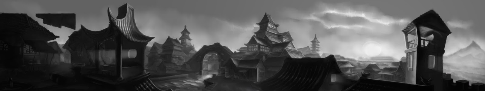
Before the meeting Oskar (lead Designer) and I sat down to go through our scrum backlog adding the art resources I had written down on my art list and conferring with our Lead Programmer. We really need to get it done so that we can put the rest of the team at work although it is hard to think of everything we need without missing something. The project is near the point where we need to discuss it with a teacher to see what is good and what might need to be changed so we can really start producing things. I have finally been able to get a somewhat clear picture in my mind of what I want the art style to look like, we want it to be inspired by comic books as we think it would fit the game and that it is something our target group will appreciate. The other artists have contributed with some really good ideas so I feel we can get started, at the moment we could probably concentrate on producing Concept Art.

I think it is a challenge as the Lead Artist to think of all the things that need to be done and how I want it since I am responsible for the final product but also recognizing the other artists' strengths so that I can put them to use in the right places. Especially since we do not really know each other that well yet but I think I am starting to get a feel of where they are at and I think the art style can be adapted to fit us all.

Finally here is what I have been doing as far as art goes. First is a sketch that Oskar and I have been working on of what our prototype might look like to help the programmers creating it and mapping out the mechanics that need to be tested. It is also thought to function as a tutorial level to teach the player all the mechanics. Second is just some experimenting with different clothing and colours on my previous character sketch. The last one is a storyboard idea I had that inspired me to go for a comic book style.

fredag 24 januari 2014

Escape

Escape is the current working name of the game we have chosen to develop, it is going to be stealth game were you are supposed to sneak your way through an airport, although, you will be given the option of killing your way through. Either choice of playing style will offer its own difficulties, for instance killing guards may cause them to increase in number and certain points may be very difficult to sneak through although that will always be an option since that is what we want to be the main mechanic. We have chosen to change the original concept dramatically, from an early 20th century story taking place on a rooftop in Chicago, to a modern day airport with very little narrative.

I still think everything feels a bit loose, it is not very easy when you are so inexperienced to know where to start but it is starting to come along now I think. I am starting to get somewhat of a picture in mind of what I want it to look like. The interior of the airport will be inspired by Arlanda and the style will be semi realistic with a cartoony hint, leaving subtle, clean line art on top. I need to make sure we create some Concept Art so that we can se how it works.

We have decided that the main character is supposed to be a woman about 30, give or take and I have created some, again, really fast sketches exploring what she might look like.

tisdag 21 januari 2014

Representing or Misrepresenting?

Today we was the first day of the second 2D-course, we had a short lecture and then a workshop of how we portray and interpret things. The workshop was designed to automatically fail as we were given the task to, in small groups, find a group of people that is completely different from the members of the group and then find images that portray that group as they want to be portrayed. It was not so much about creating a good presentation as it was an exercise showing how affected we are by our own perspective, seeing how difficult it is to portray a group the way they are and not as the stereotypes we believe they are.

We started by trying to list who we were, covering our different ethnicities, gender, social background etc. We also created a short list of who we were not, even though doing this it was very difficult to choose a group of people. There were several examples that came up but I realized that no matter how we tried, we eventually got back to stereotypes and our own preconceieved ideas. It is difficult to find what, for instance, a culture thinks represents themselves, their values and what is important to them when you are from a completely different background. Those aspects may be things we would never think of since they are not important from people from our culture. Even in the group we were from different cultures in a way with our different ethnical parentages, gender and varying social backgrounds.

It is very difficult but I feel it is a valuable lesson to learn and that it is far to easy to forget that not everyone is like yourself and think the same way you do. I did find a very interesting text that I feel explain part of this very well. In this case the author discusses why anime characters are white and comes to the conclusion that they are not, a Japanese viewer will interpret the character the way they feel is normal, as Japanese, while an American will interpret the same from what they feel is normal, being American. I do not think this is applicable to all situations though, there is still the issue with stereotypes which defines how the public see themselves and others. It does however make you think and question why you assume that everything is like you, why is your culture/ethnicity/whatever what is normal?

theotakuspot.animeblogger.net

måndag 20 januari 2014

Game Development

Today was the first day of the Game Development course, in the teams from the major assignment in the Introduction to Game Design-course we got to choose one of the other teams' designs to develop.

This time the first group meeting was a lot more structured and I felt that unlike last time we actually have some clue as to what we are doing. It does not at all feel like it did when creating "With Love..." although it is clear that we are still a bit inexperienced. I do wish that someone would have chosen to develop "With Love...", but I guess that just means that perhaps we can do it ourselves some day. We have also lost a team member unfortunately, so we will get to welcome a new member tomorrow.

Our lead designer asked me to do some thumbnails just to explore what direction we want to take the game we have chosen, which is basically a stealth game, the concept is very loose at the moment.
Here are some really fast sketches (about 1 min) that I threw together just to get the imagination going.


fredag 17 januari 2014

Finished

I just uploaded my final assignment, now I will just have to wait for my grade and I will be finished with the first 2D-course and ready to start the second 2D and the game development courses next week.
As it is getting very late I will skip uploading the reflective assignment and just show you the final drawings i handed in.

torsdag 16 januari 2014

Final Assignment Update

I have been working on the final assignments all week and they are finally starting to come together. The rendering of the city scene is what has been taking up most of the time, light can, as I have said before, be really difficult and when I thought I was nearly done I realized that I had misjudged a central part which affected the entire surrounding area.

I think I have solved it but it looked better before as long as you did not look long enough to realize that the area should be shadowed due to the angle of the rising sun. This has probably been one of the major obstacles of this assignment as I find it difficult to know exactly where a shadow will fall.

As there was a large area that ended up in shadow I decided to put light in the windows of one building to keep it from being just a dark area but I am not completely happy with the result.

Luckily I still have tomorrow to do some finishing touches, mostly making all edges more defined which is especially necessary as i decided to remove the line art, however i do worry a bit about overworking the drawing as I really want to get a good grade on this assignment. I do feel some pressure as I did not get a very good grade on my previous lighting assignment and it made me doubt myself a bit when it comes to light.

This is what it looks like right now, any thoughts on improvements are welcome.


The second assignment was to take a very rough sketch and make it solid, meaning constructing a character almost to the step of clean line art. I am happy with what I have created so far although there is still room for some improvements in certain areas.

Drawing this with the help of the construction techniques I have learnt during this course as well as the assignments testing them made it go really fast. I have hardly spent any time at all on it compared to the lighting assignment or the previous character drawing a made and it sort of makes me question if I have done enough although I do think it is the same quality as the last character drawing. That must mean I have learnt something, yay!

This is the sketch which we are supposed to refine followed by my rough underlying construction drawing, a fast sketch and the finished one.


I did struggle a bit with the hands, they are still not perfect but it did not have to be super clean line so I will probably hand this one in like this if I do not manage to throw some beautiful hands together tomorrow.

måndag 13 januari 2014

Progress

Today i got back to working on my final assignment for the 2D-course after taking a few days off for personal reasons. It is starting to come together now and I will probably wait until I get some advice in the feedback sessions later this week before doing the final touch up.

This is the first time that I am working on a city scene and it turned out, as expected, that it is tedious work and the understanding of the light can be really tricky. I am happy with what I have created so far and I am looking forwards to getting some feedback so I can make it even better.


It is way to easy to go blind after looking at a drawing too long so I am going to get started with the other part of the assignment and let this one rest until after the feedback sessions.

torsdag 9 januari 2014

Today, as well as yesterday, I have been at school working on one of the final assignments that are due next Friday. The one I am currently working on is taking a line drawing of an old, asian city and render it in grey scale. Things to consider are choosing where the light is to be coming from and what kind of lights I want to include. Since I did moonlight last time I thought I would try something different with this drawing. The city looked so still and quiet to me so I decided to set the city in the morning light of the rising sun.

Before starting to work on the drawing I googled for some reference images, this was my favourite one that I decided to reference in my rendering.


This along with the demonstration of one of our teaching assistants helped me get started, then it no longer felt as big of a challenge. I have found more than once that it is the getting started part that is more difficult for me, once I have some basic groundwork down, the rest almost just falls in to place.

Anyways, here is what I started out with yesterday and where I am at now.

onsdag 8 januari 2014

Lighting and value

The last week before christmas break we continued working on our characters, after some introduction to lighting and values we were tasked to render our line art in grey scale. Some useful things I learned this week was to start with a grey background instead of the standard white and to use reflective light to show shapes. Another thing that was brought up was to use a secondary light source to create volume, for this drawing I considered what it would look like in colour even though it would be in grey scale for this assignment. As she is a moon goddess I wanted her to be hunting in the moonlight. Therefore I chose to set the arrow on fire to contrast the cold moonlight with the warm, orange firelight.

The final image turned out better than I had hoped and I feel that the process of working with volume that I have gone through has allowed me to change the way I think when drawing. It has opened my eyes to things, many of which I already knew, that I have not been able to use and I do not believe I could have achieved what I did before this course.


There was no reflective assignment for this week so I will just add some thoughts on what we learned. I felt again that the introduction to the subject was very brief and a few of my class mates as well as myself were left wondering how to apply it. It got better a day or two later when we got a more thorough walkthrough on how to approach the task at hand, as well as getting feedback during the process of creation. I do wish we could have gotten more lecture time on the subject as it can be very tricky, you could probably fill an entire course with just lighting and values. It just felt very brief since it is a very large subject and such an important one.

tisdag 7 januari 2014

Colour Workshop with Silvy Strand

Today we had a guest lecturer in the 2D-course, freelance illustrator Silvy Strand. She started with a lecture on what it is like to work as a freelancer and gave some good tips on what you need to think of when starting a buisiness. Then she demonstrated two approaches to colouring a drawing and let us have a go at it. One of the techniques was one that I am more familiar with, blocking in the colours and then add shadows and highlights.

The other one was to start building the values in black and white and then putting a colour layer on top of it. This is a technique that I have come across before but never really appreciated as I feel it easily looks dirty and amateurish. The colours do not come to life as they would if they were painted "from scratch". I decided to give this one a go anyways after discussing with Silvy and I think that it turned out better than I thought it would. I still feel that it shows that its been painted on top of another but considering that it is the first time and the short amount of time put into it, it turned out well.

I believe colour is probably not my strongest point yet, I do know the basic theory but I find it very difficult choosing the right colours and getting them to go together as I see it in my head. Silvy was very helpful as I had some difficulties getting started, she told me a good way is to start with colouring the entire image with the general colour of the background and then the light sources. In my case it is a forest in moonlight, meaning a desaturated, dark blue-green. It felt very obvious as she told me this and it got a lot easier to pick up from there.

Here is how it turned out...

and here is a closeup.