torsdag 13 mars 2014

Ms X 2.0


This week I have completed my drawing of Ms X that I posted here a short while ago and I thought I would show you a little more about how I worked.

I had an idea of the pose I wanted, so the first thing I did was searching Google for references of women looking over their shoulder. I found one that had an angle I liked and to save me some time I moved her body and arms to get the pose I wanted. I then used that for reference of proportions and positions in a rough construction sketch and added her hips and legs. This first sketch went really fast to draw so that I could see if it would work before putting too much time into it.


When the first sketch was done I started cleaning it up, taking it to solid line art, first only her body and when I was happy with that I added the clothes and hair on top.


I used a small hard brush with shape dynamics and fast strokes to get as clean lines as possible – keeping one hand on the ctrl+z buttons. Again, I looked at Ms Marvel and decided to keep the line art thin, with the edges thicker. The lines in her hair were particularly tricky, as hair normally is, and I had to rework it several times, looking at my references, before I was happy. I also used several reference photos of silk blouses and pencil skirts to create the creases of her clothes and for the face I looked at our Concept Art.


To get cohesiveness with the background upon which she is to be placed and to get the values and slightly monochromatic colours of the Ms Marvel comic I rendered her first in grey scale, using the same brushes and techniques that I used for the background.


I started with colouring her grey and then add light and shadow and used the smudge tool to blend the colours before adding sharper details, especially in the clothes and hair – always using a hard brush. The hair was, again, a challenge as well as the face and I had to rework them several times.

To colour her I used a colour layer in Photoshop, the colours were inspired by our mood board for cohesiveness and I used only one colour for her blouse and hair, while her skirt was left very dark grey. I did not want her face to look flat though, so I added some pink, peach and reddish tones on her cheeks, chin, forehead and around her nose. 


When I finally added her to the background I also placed her underneath a gradient from the sun so that she would look affected by the sunset outside the window and an inner shadow which I changed to colour dodge in a light colour from the center of the sun to create a rim light. 


I am happy with what I have produced and I think I have made it look like the style I took inspiration from. If there was anything I would do differently it is probably the face; I think it could use some additional work to make it look more like the style I was going for although I think it works well the way it is now. If I was to redo it I would probably use sharper shadows and flatter areas of value, not blending the colours so much so that it would look more cartoony than realistic.

I has been really helpful working beside other people who can give instant feedback and notice things that are not apparent to me who was been staring at it for a while. When I was nearly done I showed it to one of our teacher's assistants to get some tips on how to best finish it and our Lead Designer, Oskar, has been a great source of feedback while working next to me.



Fly City 2.0

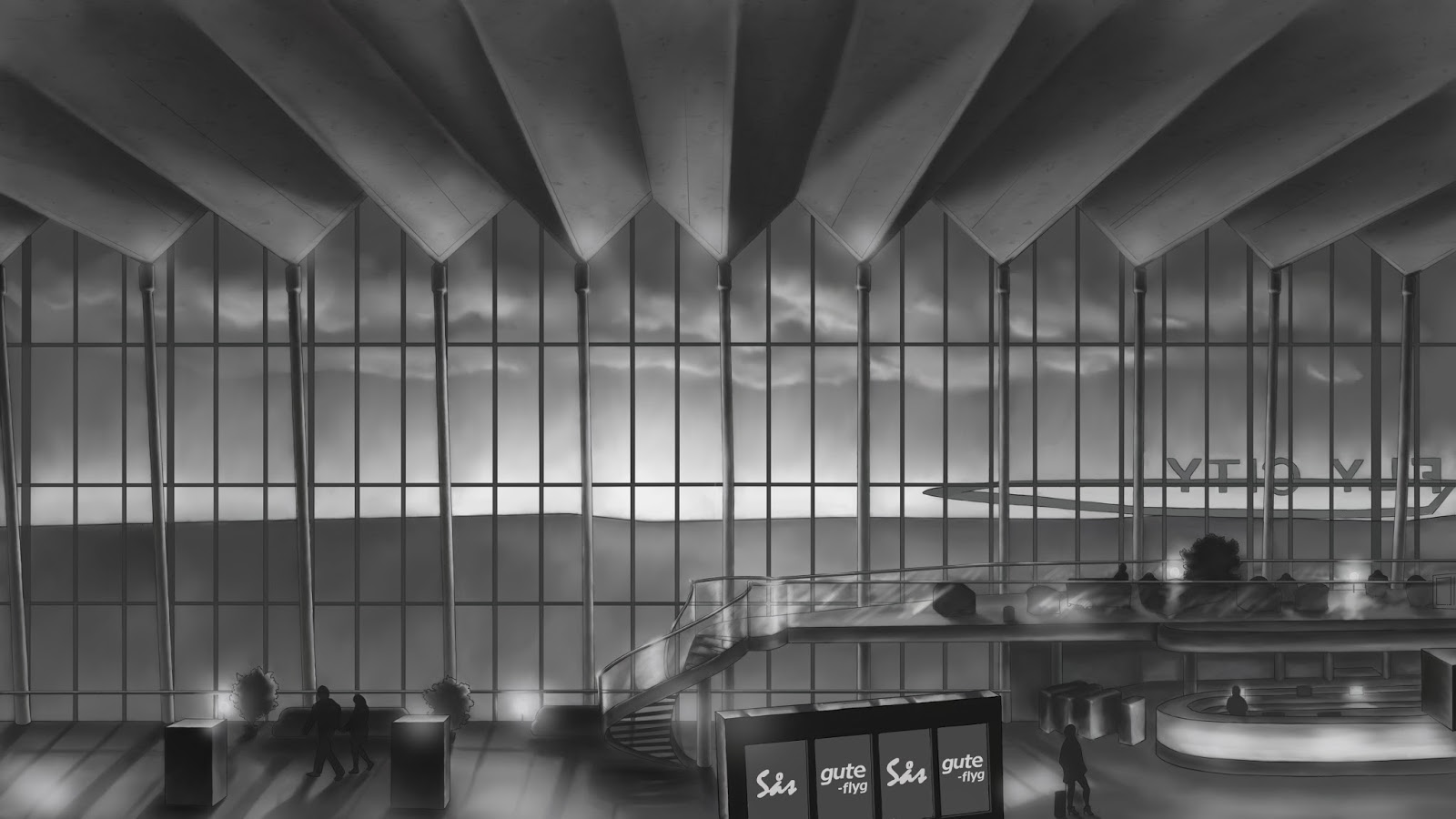
I have just finished the drawing of Ms X and the colouring of Fly City which will be the background of the main menu of "Terminal" and I thought I would just show you how it turned out. First a little recap of what it used to look like.


Here it is complete with colour and Ms X.


The colours I have picked from our mood board, trying to incorporate the colours (pinkish) purple and turquoise that we have chosen for "Terminal". I have used a colour layer to create a base and then added the sunset and light on top of it.

The sunset is consistent of three gradients, one colour layer, one colour dodge layer and one linear dodge layer, the latter one I have placed on top so that it lights up the character slightly. I have also placed a copy of the base colour layer on top of her on low opacity so that she will blend into the purple light better and put "inner shadow" on her to create the rim light from the sun by changing the colour to the colour of the sun and the mode to colour dodge.

For the lights I have played around with linear dodge on both layers and brushes.

fredag 7 mars 2014

Ms X

Yesterday I started on the first real depiction of our main character, known only as Ms X, which is to go on the main menu. I started with a rough sketch which I have reworked into clean line art, aiming at the style of the Ms Marvel comic, with thin line art that is thicker on the edges. I chose the pose and facial expression since I wanted to capture the essence of the game in the main menu. She is supposed to look worried/scared and like she is trying to get away from something, while showing her feminine personality.

This is how my rough sketch looked and the (almost) final result, the skirt needs some detail, creases and perhaps a seam, and the eyes need some additional clean up, but otherwise the line art is pretty much complete.


For the line art I used a small, hard brush with shape dynamics and quick strokes, pressing ctrl+z until the lines where as I wanted them to be. Finally I used the eraser, again a hard brush, to touch up any lines that were not completely straight, too thick or too long.

The creases of the blouse were a bit tricky and I used Google to find some images of silk blouses for reference which were really helpful. The hair was also a bit of a challenge, I think it is hard drawing hair that looks good, so I should probably practice a lot more. I will get to do that when I start to render this drawing and when starting on the win and loose screens and the intro.

torsdag 6 mars 2014

Terminal: Fly City


After the Alpha we felt that we really wanted to have a main menu for the Beta presentation and moved it up on our priority list. I started right away with doing some really fast sketches, trying to explore different ideas and layouts. Some ideas that we had did not fit the game we are creating, for instance, we had an idea of the interrogation room where the game starts, with a flickering lamp. This put on paper looked like it would fit better on a 1930s inspired mafia or crime game.

Below are some of the sketches I came up with, the two on the top left and the right middle one were the ones I felt fit the concept of the game best as they show that you are at an airport, they show the main character looking worried or fleeing and they fit the comic book theme. The one we chose to work on was the middle one on the top since that was the one that best incorporated everything the game is supposed to be. 


I already had some photos from Sky City in Arlanda in our inspiration folder that I used for inspiration. I felt that those huge windows and the shiny wooden floor was very inspiring and I wanted to create a sunset coming through the windows both to establish the time of day of the game and to incorporate the purple colour scheme we have chosen. For the style of the scene I chose to take inspiration from Ms Marvel, which has very thin line art, lots of smooth gradients, soft highlights and subtle textures.


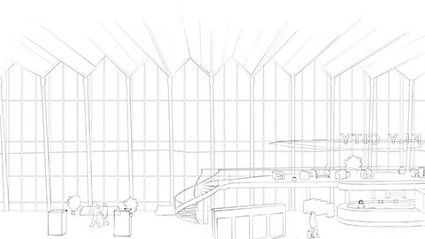
I spent many hours doing a rough sketch and turning it into clean line art. Since the buttons will go on the left I decided to leave that area a bit empty to keep it from looking too busy. The main character will be positioned in the right part and therefore I chose to put the beautiful spiral staircase between them so it would not be covered. Next thing was getting the basic values down, deciding where the light and shadows will be.

Many hours followed after that rendering it and reworking things that did not look right. The technique I used was to first block out and then use smudge tool to blend them, working over the entire image the whole time and not getting into detail. I went over it several times, each time getting more and more into detail before adding the final touches with highlights, giving more detail where needed. I will show you some of the steps, from line art to finished drawing of “Fly City”, so that you can see how I have been working.


Creating this image took me many hours, I need to practice doing things like this more often so that I will get faster. I have been trying to utilize what I have learnt since I started at GAME, especially line art and atmospheric perspective, making things darker in the top, lighter in the bottom and using more contrast and darker colours closer to the viewer and vice versa.

We have after choosing this design thought about using an arrival/departure sign for the menu, however I feel that it will look empty since there will be only four options on the main menu (originally only three). The space between the buttons will allow us to use more space on the screen without it looking empty and they will still be inspired by an arrival/departure sign.