After the
Alpha we felt that we really wanted to have a main menu for the Beta
presentation and moved it up on our priority list. I started right away with
doing some really fast sketches, trying to explore different ideas and layouts.
Some ideas that we had did not fit the game we are creating, for instance, we
had an idea of the interrogation room where the game starts, with a flickering
lamp. This put on paper looked like it would fit better on a 1930s inspired
mafia or crime game.
Below are
some of the sketches I came up with, the two on the top left and the right
middle one were the ones I felt fit the concept of the game best as they show
that you are at an airport, they show the main character looking worried or
fleeing and they fit the comic book theme. The one we chose to work on was the
middle one on the top since that was the one that best incorporated everything
the game is supposed to be.
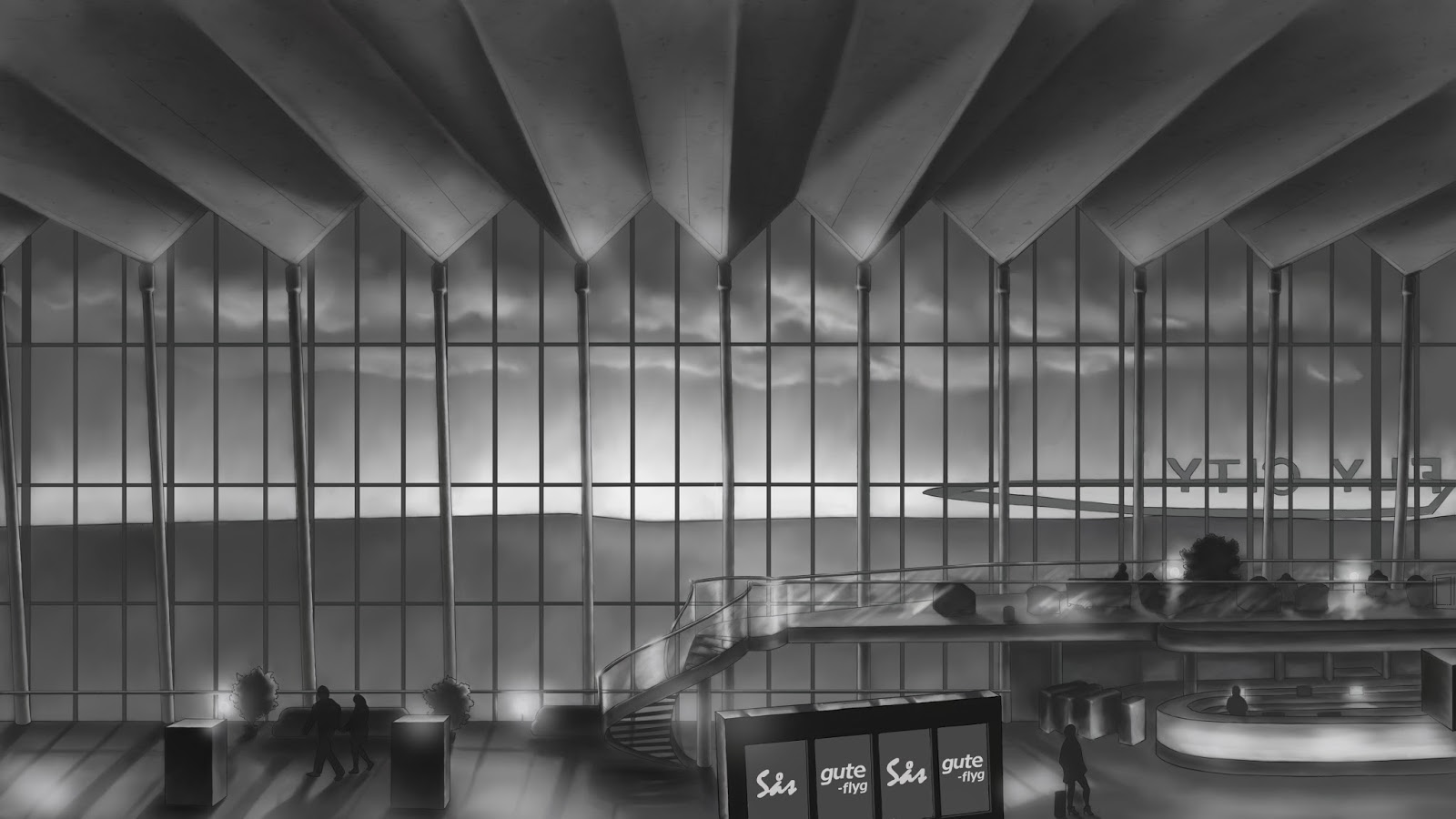
I already
had some photos from Sky City in Arlanda in our inspiration folder that I used
for inspiration. I felt that those huge windows and the shiny wooden floor was
very inspiring and I wanted to create a sunset coming through the windows both
to establish the time of day of the game and to incorporate the purple colour
scheme we have chosen. For the style of the scene I chose to take inspiration
from Ms Marvel, which has very thin line art, lots of smooth gradients, soft highlights
and subtle textures.
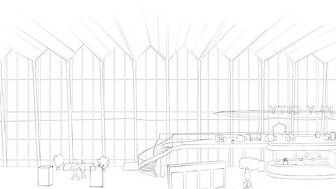
I spent
many hours doing a rough sketch and turning it into clean line art. Since the
buttons will go on the left I decided to leave that area a bit empty to keep it
from looking too busy. The main character will be positioned in the right part
and therefore I chose to put the beautiful spiral staircase between them so it
would not be covered. Next thing was getting the basic values down, deciding
where the light and shadows will be.
We have
after choosing this design thought about using an arrival/departure sign for
the menu, however I feel that it will look empty since there will be only four
options on the main menu (originally only three). The space between the buttons
will allow us to use more space on the screen without it looking empty and they
will still be inspired by an arrival/departure sign.


I think that you are right that it is a good idea to include a main menu for the beta. Although I didn't get an opportunity to try your game out during the beta-testing yesterday, what I saw of it already looked like it could be nearing completion graphically. It already appeared rather coherent and polished, and adding a main menu will surely give a bit more polished feel for the beta demonstration overall.
SvaraRaderaI have to say that it is always nice to see sketches and reasoning around decisions. Although I think that a few of the options among your sketches could have made for quite impactful main menus, it was probably a good idea to pick one that showcased the game's environment as well as the main character.
A couple of questions that arose though, is the terminal that you have drawn an existing one? You speak of details, such as the wooden floor and the stairs, almost like they are objects in the Fly City terminal that you have chosen to include.
Also you mentioned the purple color scheme, is this picture going to be colored as well? If so I have to commend you! I always found it very hard to add color to a detailed grey-scale picture.
It is also good to see that you managed to include a lot of the theories and methods that we have learned over the graphics courses.
About the last paragraph, I'm not entirely sure what you mean.
Did you think about a design that you later replaced with another, similar design, or just decide on re-positioning the buttons?
Overall a nice post though. Nice to see that you have been able to use what you have learned since starting GAME, and to good results!