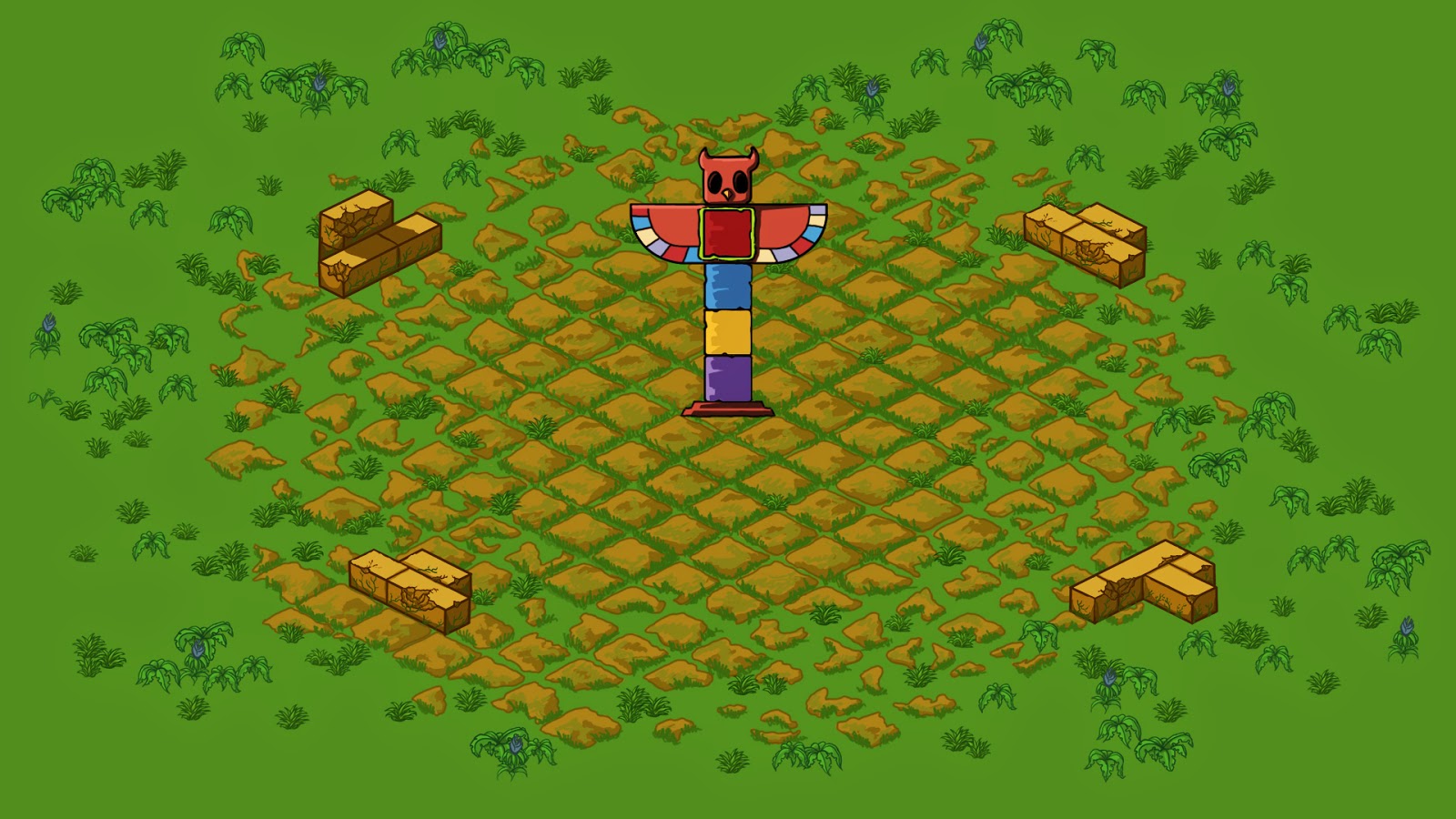
Here is how it looked before...
and now...
I decided to recycle the plants we already had by changing the colour and bringing down the contrast to make them fit and blend into the background better. I used the grass mostly towards the center and the more jungle-looking plants towards the edges to make it look like a ruin centered in a jungle. During the playtesting session last week we got some comments that the screen felt a bit cluttered and i think that it was partly because the plants stood out so much against the background. By making them blend in more I have been able to use more of them, making the environment more interesting, without making it look as cluttered. I still have to wait until all new obstacles and the level design is complete so that we can test it properly in-game, but it is looking good so far.


Inga kommentarer:
Skicka en kommentar