This week
we have been modelling crates in 3D class, here is the result of Wednesday’s
workshop.
Medieval
The
medieval theme is characterized by organic shapes and forms, even geometric
forms would have an organic feel to them due to the crude tools that would be
available in the world. Using sharp clean lines and geometric forms would take
away from the historical illusion. Textures used in this theme are mostly
metal, wood, stone and cloth.
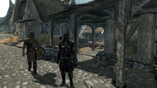
Skyrim is
an excellent example of this theme, mainly due to the textures and shapes that
are used. Even if the buildings look man-made lines and shapes make them appear
somewhat organic, as if the world is built from what nature provides.
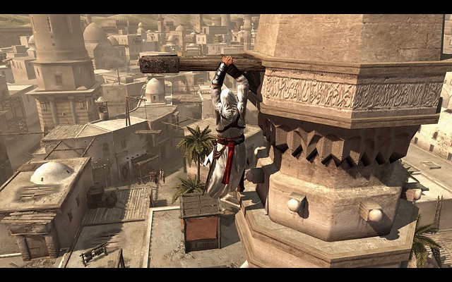
Another
example is the first Assassin’s creed game, although it is not the typical
western European medieval environments, the developers have done their research
and used shapes and textures while referencing real history. Similar to Skyrim
the shapes and lines are somewhat organic and much of the style is provided by
the earthy, organic textures.
I was
aiming for a simple wooden chest with metal reinforcements, adding details to
make it seem like it would fit into the medieval theme. As far as the shape
goes I feel that it is perhaps not typically medieval but considering this was
my first real creation in 3Ds Max I am quite happy with the result.
I had an
image that I used for inspiration but I did not really feel as if I could
clearly picture what to do and this first one felt a bit as a trial run. Also I
think that much of the medieval theme will be accomplished by the use of
textures as I feel that material is essential to this theme.
What I feel that I
probably failed to accomplish was to make it look more organic, all lines are
very crisp and the edges are straight so that is something that I should work
on but I think I need a bit more practice with the program to do so.
Urban
contemporary
This theme would
be made up from a lot of geometric shapes, almost all elements man-made, values
can range from high to low key and textures can be made from a ton of different
materials, usually a bit worn down and dirty.
GTA is a
good example that I took inspiration from when creating my dumpster, it is in
the middle of a city, not the fancy blocks but worn down and gritty.
Need for
Speed is another good example, where high key neon-lights is placed in a low
key city environment built of geometric shapes.
I wanted to
try and make something different from a typical crate so I took inspiration
from GTA and created a dumpster, I decided to make mine a bit simpler than the
one I referenced, maintaining clean, sharp, geometric shapes to make it fit in
the theme.
When I get more experienced with the program I could probably do
more details to it but I wanted to try and make something that had just the
information needed for the silhouette and be put right into a game and I feel
that I accomplished that.
Sci-Fi
In this
theme you will find clean lines, geometric, but often rounded, and streamlined shapes.
The colour schemes are usually blue, sometimes purple, and the textures used plastic
and metal looking materials.
The Mass Effect
Series is a typical game from this theme, the shapes, textures and colours
used, create a world that looks futuristic and outerworldly.
Star Wars
the Old Republic is another example, again the shapes, textures and colours
makes the environments look as if you are in another world.
I was
aiming to find the shapes that you see in Mass Effect and Star wars, when
creating my crate. The first version was a bit too simple though as it was not
instantly obvious what theme it fit into, so I decided to add a bunch of
details, unnecessasy to function really after listerning to my teacher saying
that Sci-Fi is a genre that really suffers from the Z-brush-syndrome.
I am very
happy with the end result and I feel like I got better with each crate produced.
It is pretty much exactly what I was aiming for and I felt this was probably
the easiest one since I had a clear image in mind of what to create.
As a
beginner I do not really see any negative points to this exercise, as I have
studied Life Drawing, I have learnt that everything
is made from boxes and cylinders. By doing this exercise we got to learn how
to manipulate these shapes and although I will need tons and tons of practice,
I feel this exercise went through the basics tools that can be used to
manipulate boxes and cylinders into anything.
Using a
theme was also very useful as it forced you to think of the Elements of Art,
what shapes would I need to accomplish a certain theme? It also made it easier
to form a clear image in my head of what to create, which I think is one of the
most powerful tools when creating 3D, or art in general.
I felt as
if I did better and better for each crate although I still have a long way to
go. All in all I am happy with what I have created but I still think that the
medieval one could use some more work. The urban one also looks a bit plain
after doing the Sci-Fi one but I think that is a stylistic choice that I feel
fits the theme.


Inga kommentarer:
Skicka en kommentar